User experience (UX) in WordPress is everything. It’s not a trend or an afterthought. It’s a critical component of your website’s success. A well-crafted UX on your WordPress site can boost conversion rates, reduce bounce rates, and increase overall customer satisfaction.
Enhancing UX has a substantial potential return on investment, with every dollar spent potentially yielding up to $100.
But how can you achieve this? Well, let’s approach this like a diagnostician.
We’ll begin this journey to overhaul your WordPress site by examining common UX problems and offering practical strategies for fixing them.
What follows are 9 UX problems WordPress site owners face, presented with tips and strategies for fixing them.
1. Sluggish load times
Nothing tests a visitor’s patience like a slow-loading website. It’s a fact: over half of mobile users will ditch a site if it takes more than three seconds to load. So, your site’s speed can make or break the user experience.
Thankfully, there are several ways to address this:
Start with a speed diagnosis
Use tools like Google PageSpeed Insights to get a clear picture of your site’s performance. This tool doesn’t just spit out a speed score.
Rather, it offers a breakdown of what’s slowing your site down and gives tailored advice on how to fix it. Think of it as a website health check-up. And it should be one of your first resources when diagnosing a UX problem.
Shrink image sizes

Big, bulky images are one of the top culprits behind slow site speeds. Plugins like WP-Optimize can reduce image file sizes without sacrificing the quality of your visuals. This helps your pages load faster and keep your visitors happy.
You can also run your images through a tool like TinyPNG to cut down image sizes before uploading them to WordPress.
Use caching
Caching can give your site a significant speed boost. It works by storing parts of your site in temporary storage for quick access. WP-Optimize, again, is a great WordPress plugin for this and can help you configure this feature easily. Visitors will enjoy much faster loading times, and the boost in site performance can also help it perform better in search results.
Opt for top-notch hosting
The backbone of your site’s performance is your hosting service. Kinsta offers managed WordPress hosting that includes Edge Caching and a powerful Content Delivery Network (CDN).
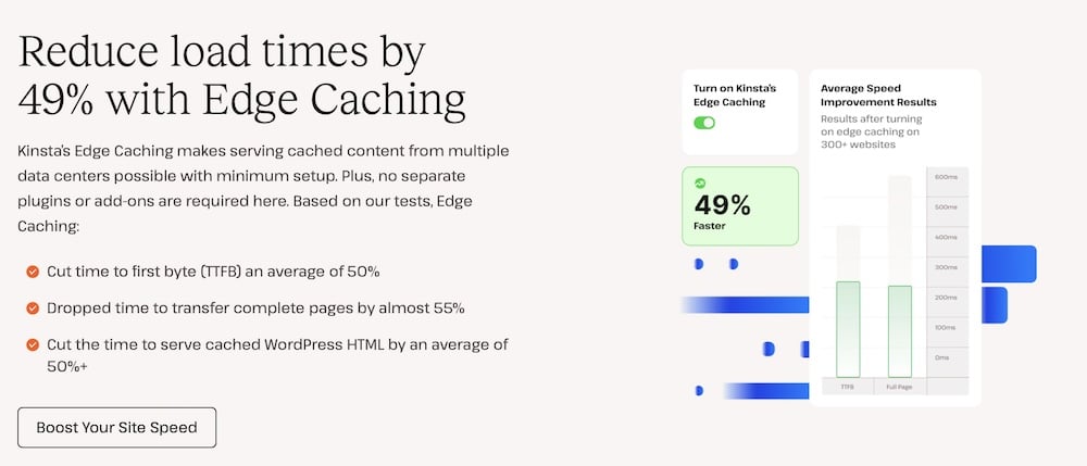
This setup speeds up your site for visitors from around the globe and ensures it can handle traffic spikes.
2. Overly complicated design
It’s no secret that design is critical in making that first, instant impression. A whopping 94% of first impressions are related to your site’s design. So, if your WordPress site feels cluttered or difficult to navigate, you might lose a visitor before they’ve even had a chance to explore whatever it is you’re selling.
Here’s how to make sure that doesn’t happen:
Simplify your navigation
Keep your site navigation simple and intuitive. Make sure that it’s easy for visitors to find what they’re looking for by organizing your menu structure. Limit the number of menu items and categorize them logically.
The goal is to ensure that essential information is no more than a few clicks away. This approach improves the user experience and helps with SEO by making it easier for search engines to index your site content.
Use a responsive design
Today, your audience will visit your site from a variety of devices, including smartphones, tablets, and desktops. A responsive design ensures your site looks great and functions flawlessly across all these devices.
To be clear, a design is responsive when it adapts to the screen size and orientation of the device being used. This means no matter where your users come from or what device they use. They get the same quality experience.
Using a responsive design improves accessibility and usability. Fortunately, most WordPress themes are responsive by default. But it’s still imperative to ensure any theme you use indicates that it’s responsive. And you should test it yourself. After installation, open your test site on a desktop computer (in multiple browsers) and do the same on mobile devices.
3. Poor content presentation
Content is important, but how it’s presented can either captivate or alienate your audience. Poorly structured or visually unappealing content can quickly deter visitors, no matter how valuable the information might be. After all, the best content won’t make an impact if no one stays around to read it.
Here are a few ways you can fix how your content is presented:
Creating high-quality, engaging content
Start by ensuring your content is informative, engaging, and visually appealing. Use active voice and conversational tone to make your text more relatable and easier to digest. Include relevant images, videos, and infographics to break up text and add visual interest.
And make full use of the design options available to you in WordPress. The Block Editor makes designing interesting-looking pages easy – so make use of them.
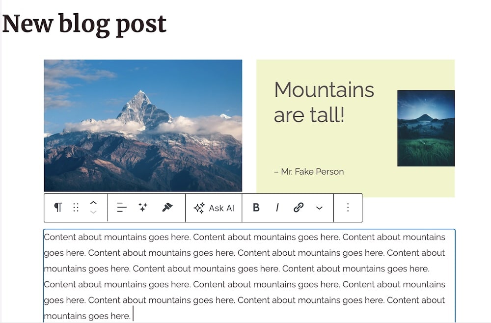
For instance, you can turn a standard blog post into something that looks like a magazine article with just a few extra clicks.
Structure your content for readability
Break your content into manageable chunks. Use headlines that capture the essence of the following section, making it easier for users to scan through and find the information they need.
You can also use bullet points to list important details concisely and keep paragraphs short to maintain the reader’s attention. These formatting choices improve readability and enhance the overall user experience by making information accessible at a glance.
4. Too many plugins
Plugins add features to WordPress, but too many can bog down your site. That is, it could make your site load more slowly. And that’s to say nothing of the potential security risks. Each additional plugin introduces potential vulnerabilities and can increase loading times.
And while it’s true that site visitors likely won’t have any idea as to the plugins you’re using, a site slowdown would directly affect them.
You can fix this by:
Using only essential plugins
Evaluate the plugins you currently have installed. Ask yourself whether each one serves a vital function. If you decide that a plugin is essential, keep it up to date. Regular updates help fix security issues and optimize performance, as developers often refine their code with each update.
Removing unused plugins
It’s not uncommon to try out different plugins and forget about them. However, each inactive plugin sitting on your website is a potential security risk and could slow down your site. Take the time to clean up your WordPress installation by uninstalling and deleting any plugins that you’re not actively using.
To prevent plugin buildup, schedule a site tuneup where you go over potential issues like this once every three months.
5. Complicated and unintuitive forms
According to Walker Sands, around 68% of users are reluctant to fill out forms that ask for too much personal information. When forms are too complicated or seem invasive, potential customers are more likely to abandon them. This can reduce your conversion rates – often unnecessarily – if you’re asking for more information than you need.
Thankfully, you can remedy this in WordPress fairly easily.
Design straightforward forms
Keep your forms simple and to the point. Only ask for information that’s essential for the process at hand. Whether it’s a signup form, a purchase order, or a newsletter subscription, limit the number of fields to only necessary ones.
This minimizes user effort and maximizes completion rates. A plugin like Gravity Forms is super helpful for adding the ability to customize forms to your specific needs to the WordPress dashboard.
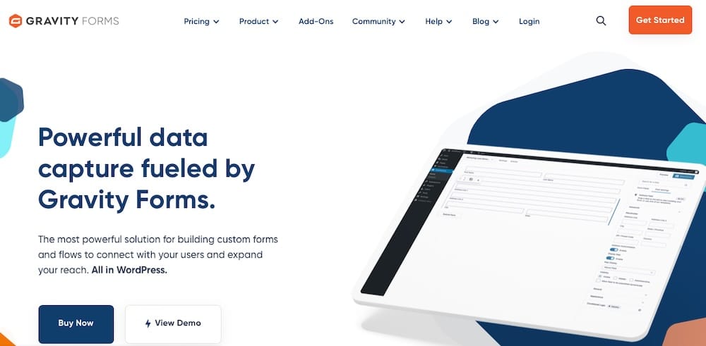
Clarify calls-to-action
Ensure every call to action (CTA) on your site is clear and compelling. Site visitors should immediately know, at a glance, what will happen when they click a button or submit a form.
Use action-oriented language that motivates people to take the next step. And ensure these buttons are prominently displayed and easy to interact with. Highlight them with a contrasting color.
We keep it simple on our managed hosting page, but even here you can see the CTA buttons are clear.

6. Neglecting aesthetics and readability
It’s striking but true that a large part of a website’s credibility comes from its aesthetics. People are quick to make judgments, and a site that looks outdated or hard to read can make visitors skeptical about its quality and trustworthiness. To prevent this, you’ll need to make a mindful effort to keep your site looking polished and up-to-date.
Here’s how to do this in WordPress:
Select a theme that mirrors your brand
The design of your website should be a reflection of your brand identity and should resonate with your target audience. Choosing a WordPress theme that aligns with your brand’s values and aesthetic can create a strong first impression and make it easier to build audience trust.

The theme you choose will depend on your niche, but themes like Astra and Kadence are generally well-regarded.
Keep your theme updated
No matter which theme you choose, it’s imperative that you keep it up to date. Failing to do so can leave your site open to security vulnerabilities. But it can also mean design updates aren’t applied to your site when they roll out, leaving your site behind in terms of style and features.
Be selective about fonts and colors
The readability of your website also heavily influences user experience. Opt for fonts that are easy on the eyes and ensure sufficient contrast between text and background colors.
A well-considered color scheme enhances the aesthetic appeal, of course, but it also contributes to the overall usability of your site. Ensure that your color choices don’t overwhelm your content but rather complement it.
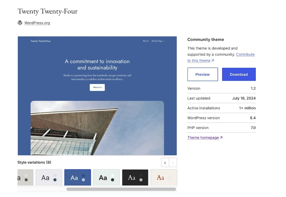
Using a theme with built-in, premade color schemes is a good idea. It removes some guesswork and ensures the colors you opt for will look good together. The style variations included in the Twenty Twenty-Four theme offer a good representation of this:
7. Inefficient media usage
While putting media like videos and images on your website can boost engagement, they also come with a downside: they can be heavy on resources. Large image or video files can dramatically slow down your site. And no one wants that.
But including multimedia elements is super important, and the data doesn’t lie. According to a study by GoodFirms, 73% of users are more likely to make a purchase after watching a product video. So you need it, but you need to manage it wisely.
In WordPress, here’s how to do it:
Embed videos from external platforms
Instead of hosting videos directly on your server, which can consume a lot of bandwidth and storage, embed them from platforms like YouTube. This method allows you to take advantage of the sophisticated streaming capabilities of these platforms without burdening your site’s resources.
Implement lazy loading
Lazy loading is a technique that loads images and videos only when they enter the browser’s viewport (when they become visible to the site visitor).
Using lazy loading speeds up the initial page load time and saves bandwidth for both the server and the end user. Loading media-on-demand rather than all at once improves site speed and allows you to include all those fun photos and videos without reducing site performance.

You can use a plugin like WP Rocket or a3 Lazy Load to enable this feature.
8. Limited accessibility
Accessibility is vital to ensure the maximum number of people can access your site at any given time. Websites that are difficult to navigate for users with disabilities miss out on engaging a significant part of the population. This is detrimental from both an ethical and business perspective.
To remedy this, you should expand your site’s reach by adhering to the latest accessibility standards.
Adhere to Web Content Accessibility Guidelines (WCAG)
Reviewing and implementing the WCAG guidelines should be your first step toward making your website accessible to all users.
WCAG provides a set of recommendations for making web content more accessible, such as keyboard-navigated menus, color options for those with visual impairments, compatibility with screen readers, and so forth.
Implementing these guidelines ensures that your website can be used by people of all abilities and disabilities. They cover a wide range of elements like colors, fonts, and interactive functions to ensure that everyone can navigate your site effectively.
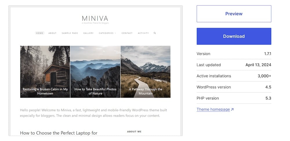
Some WordPress themes, like Miniva, are accessible upon installation or “accessibility-ready,” which means they can be customized easily to meet WCAG.
Conduct regular accessibility testing
Tools like WAVE or Axe are invaluable for regularly testing your website’s accessibility. These tools can help identify elements of your website that may not be accessible to people with disabilities, such as poor contrast or lack of keyboard navigability.
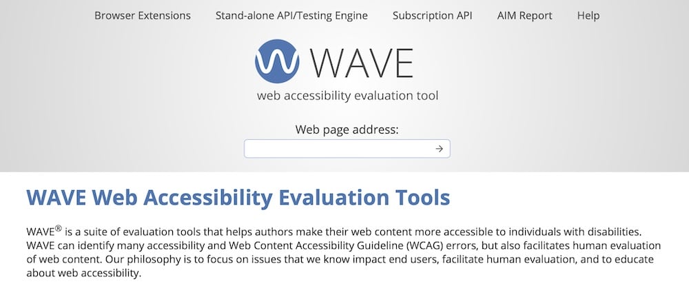
Regular testing allows you to address these issues promptly and maintain a high standard of user experience.
9. Security vulnerabilities
Website security is vital for protecting data and safeguarding the user experience, especially for WordPress sites that handle sensitive interactions through comment sections, subscriptions, and e-commerce shops.
People need to trust that their data is secure when browsing, commenting, subscribing, or making purchases on your site. Any breach or even the perception of vulnerability can damage that trust, potentially driving away customers and impacting your brand reputation.
There are ways to improve UX issues caused by security flaws, however:
Implement strong security measures
Incorporating advanced security protocols like SSL certificates is essential to ensure the highest level of security. SSL certificates encrypt the data transmitted between your server and users’ devices. If your site handles sensitive information (like customers’ payment information or email addresses), you need this.
However, you can get even more protection by using Kinsta. Our services include the Google Cloud Platform’s security model, providing a secure infrastructure for your WordPress site. This includes hardware security implementations and built-in network security that shields your site from attacks and unauthorized access. Kinsta also features automatic backups and expert support to address any security concerns that may arise quickly.
The Cloudflare integration enhances security with benefits like DDoS protection and web application firewalls, ensuring comprehensive security coverage.
Keep WordPress updated
It’s also essential to maintain your WordPress site’s core, themes, and plugins with the latest updates.
Each update usually includes enhancements to the features you’re already using, as well as patches for known security vulnerabilities. The longer your site is outdated, the more opportunity you provide to would-be cybercriminals to breach your site.
If you need help keeping up with updates, Kinsta’s managed WordPress hosting ensures updates are handled promptly, reducing the risk of security breaches that could exploit outdated software.
Summary
Transforming your WordPress site’s UX is not merely about enhancing its look and feel but also about optimizing performance, security, and user interaction. By addressing the nine UX issues presented here and using the practical tips we’ve offered, you can improve how visitors perceive and interact with your site.
Leverage these insights and tips to make your WordPress site functional and truly user-centric. Your journey towards a remarkable user experience begins here! To further boost your site’s UX, consider partnering with a hosting provider like Kinsta, which prioritizes both performance and security.

