Are you ready to unleash the potential of Zakra 3.0????
We are happy to announce that the latest improved version of Zakra has been released on 18 July 2023.
The best part is that we’ve also released Zakra Pro 2.0 simultaneously for our premium users.
Our trusted theme has empowered users like you to create stunning websites for years. Now, we’re taking it to the next level with Zakra 3.0 and Pro 2.0.
Our developers have worked really hard and invested countless hours to present you with the best version of Zakra. After all, happy customers are our utmost priority.
So, if you’re curious about what’s in Zakra 3.0 and Pro 2.0, let’s delve in without further ado.
Major Motives Behind Zakra 3.0 and Pro 2.0 Update
We believe in adapting and keeping pace with the constantly evolving web landscape.
And that’s why we’ve left no stone unturned to maximize the potential of our multipurpose WordPress theme, i.e., Zakra.
We aim to offer you unmatched performance, exquisite personalization options, and enhanced flexibility with Zakra 3.0 and Pro 2.0.
Thus, it’ll enable you to create your ideal website with greater convenience effortlessly.
And with that said, it’s time to know what’s exclusive in our Zakra 3.0 and Pro 2.0.
What to do Before Updating to the Newest Version of Zakra?
Before proceeding with Zakra 3.0 and Pro 2.0, we recommend creating a backup of your website.
It’s a crucial step to ensure that you can restore your website if any issue arises during the update process.
Additionally, we advise taking a screenshot or recording your code settings and configurations. Ensure you keep them in a secure location if you need them for future reference.
If you have any questions, need assistance, or run into issues, kindly contact our support team via contact forms or live chat without any hesitation.
What’s New in Zakra 3.0 and Pro 2.0?
In Zakra 3.0 and Pro 2.0, we’ve mainly focused on overall design improvements, layouts, responsiveness, customizability, etc.
So, let’s get to know each of the Zakra updates in detail now.
A. Design Enhancement
The visual appearance makes a big difference in impressing and engaging users on your website.
Therefore, to help you make a positive impression on your visitors, we’ve improved the front page designs, layouts, default block design, and more.
Thus, let’s talk about these front-end improvements now!
1. Front-end Pages Improvement
The default pages, such as the Home Page, Single Post Page, Blog Page, Sample Page, and Category Page, have significantly been redesigned for better readability.
There’s a substantial improvement to the color contrast on these pages and to the sidebar.
Specifically, we’ve refined the Widget Title Style, Search Widget Style, and Link Hover Style of the sidebar, enhancing its overall design with a more professional touch.
Likewise, the 404 Page was quite plain and unremarkable in the previous version.
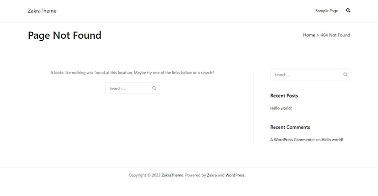
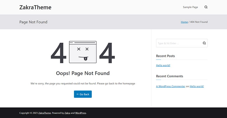
Contrarily, in the latest update, the 404 Page has been revamped for a visually appealing experience. It now showcases an attractive image and presents a clear message indicating the page cannot be found.
Additionally, it includes a convenient link that directs users back to the homepage, ensuring seamless navigation.
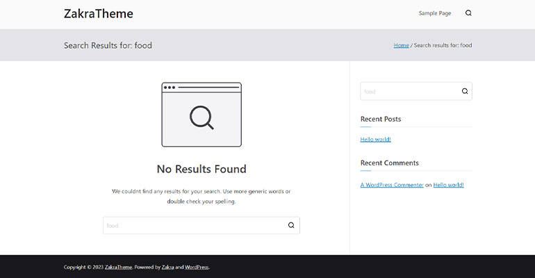
Besides, we also have refined the Search Result Page for a better user experience.
2. Layouts Refinement
The header and footer layouts are pivotal in ensuring a seamless user experience. That’s why we’ve upgraded the designs of the header, footer, as well as blog layouts.
Header Layouts
Previously, there were three style options available for the Header Main area.
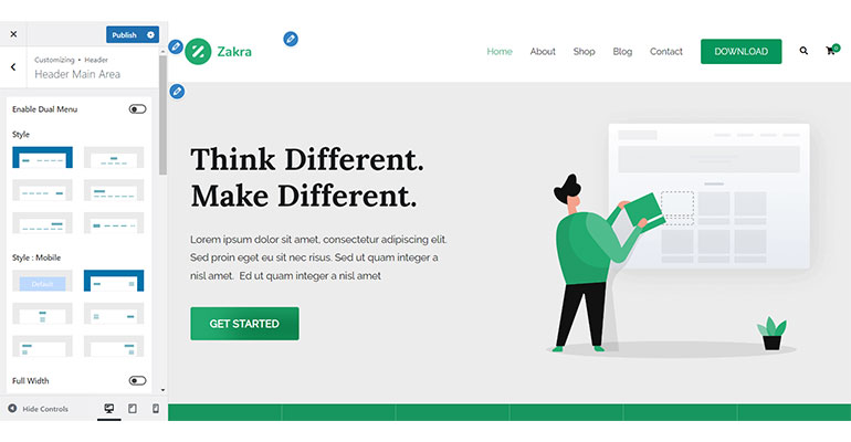
However, these style options are now redistributed into different layouts with advanced styles.
There are a total of three layouts available. Nevertheless, only two are available with the free Zakra 3.0 version.
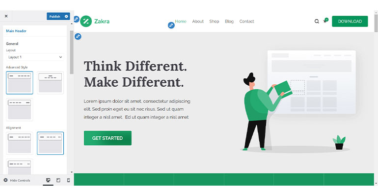
Layout 1 has three styles: Logo Left-Menu Right, Logo Right-Menu Left, and Logo and Menu Center.
In Layout 2, you’ll see a two-row style. Further, with Zakra Pro 2.0, Layout 2 provides a range of style choices enabling you to modify the logo’s position.
It means you’ll be free to place the logo anywhere within the layout.
Additionally, Zakra Pro also offers you Layout 3 with a dual menu. Menu 1 appears at the top left side, Menu 2 appears at the top right side, and the logo appears at the center.
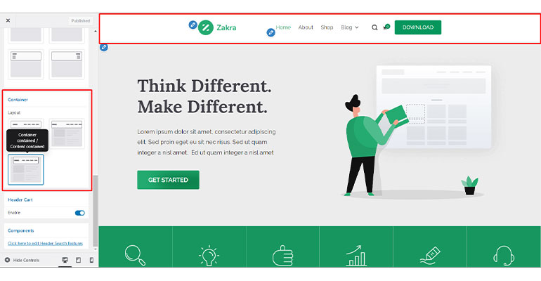
Also, the previously available Full Width option has been transitioned to the Main Header Container Layout with the following three choices.
- Container Full Width / Content Contained: In this option, the container spans the full width of the screen while the content remains within a specified width.
- Container Full Width / Content Stretched: In this option, the container occupies the entire screen width, and the content is stretched to fill the available space.
- Container Contained / Content Contained: This option restricts both the container and the content within a specified width, ensuring a contained and structured layout.
Footer Layouts
In the previous versions, the footer styles lacked visual appeal and appeared bland.
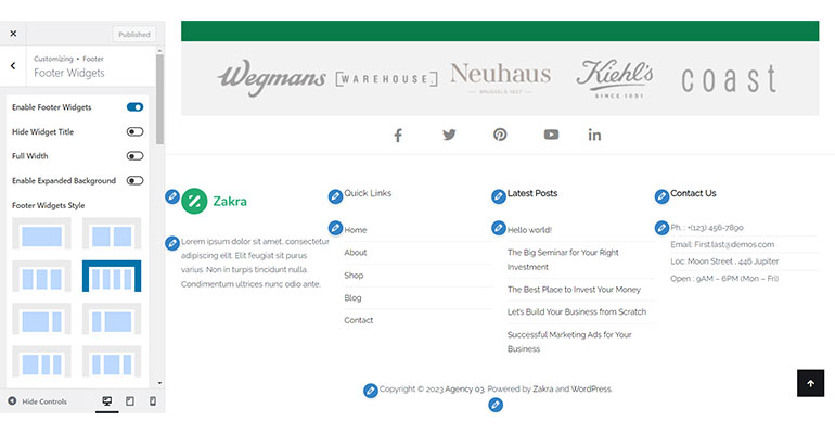
However, in the latest update, we’ve introduced advanced style options for the footer section.
These new style options include fascinating features such as color overlays, which enhance the overall look and feel of the footer section.
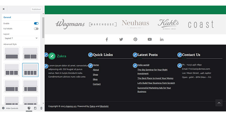
Furthermore, the Zakra Pro, on the other hand, provides two-Footer column layouts: Layout 1 and Layout 2.
Layout 1 has One Row style, which allows for a single-row design.
Contrarily, Layout 2 comes with the Two-Row style, enabling a layout with two rows. Thus, you get more options to customize your footer column.
Blog Layouts
The previous blog styles, Default and Thumbnail, available in the premium Zakra theme, have been merged into Layout 1 in Zakra Pro 2.0.
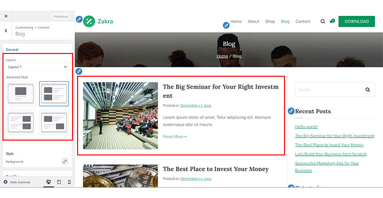
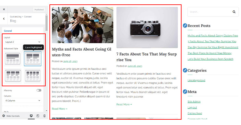
Likewise, the Grid style has been relocated to Layout 2, which now includes Advanced Style options to highlight the posts based on the grid style column.
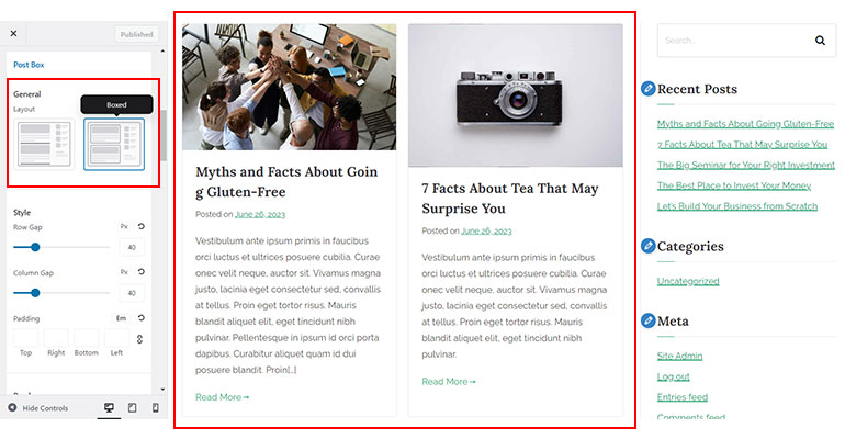
Also, in addition to the existing styles, new layout options like Bordered and Boxed have been added to enhance the Post Box style.
3. Default Block Design Enhancement
Zakra 3.0 also introduces an enhanced default WordPress block design.
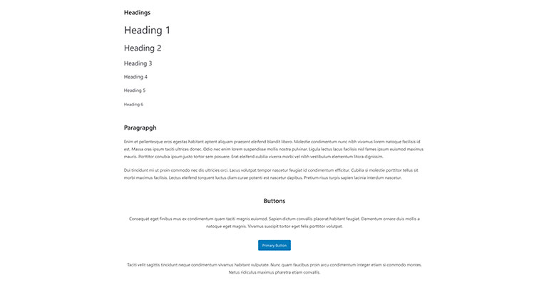
It means there’s an improvisation on how the paragraphs, headings, images, buttons, and other default WordPress blocks appear on your site.
Furthermore, the HTML tags and block codes have been refined, contributing to the overall aesthetic appeal of your content.
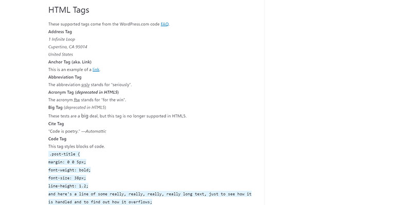
These enhancements ensure that your website’s content is visually pleasing and engaging for your audience.
4. Other Component Improvements
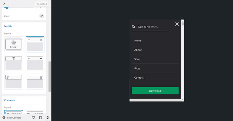
In addition to the previously mentioned updates, there’s a significant change in the Search Bar of the header.
Previously, the Search Bar appeared congested, with limited space for entering search queries.
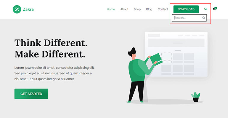
However, now it features an expanded search space, allowing you to enter your queries comfortably.
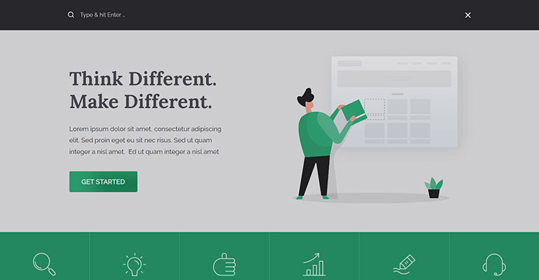
Furthermore, we’ve implemented a background color overlay to enhance the user experience.
It’s also worth noting that you can enable or disable the header search feature as per your preference.
Likewise, we’ve also switched from a desktop-first design to a mobile-first design of the theme, as almost half of the web traffic is generated from the mobile.
Thus, we’ve also polished the Mobile Menu to ensure seamless adaptability on any device.
So, you can rest assured that your website will appear perfectly on mobile screens without any concerns.
B. Customind Refactor
The next big change introduced in Zakra 3.0 and Pro 2.0 is the Customind refactor. To put it simply, Customind refactor refers to the improvement in the core library of the theme itself.
The new controls and settings introduced are as follows.
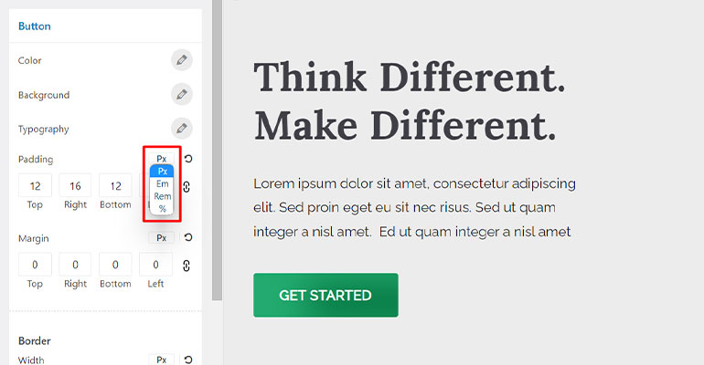
- Units Selector Settings: It’s a newly added setting that enables you to choose from units like px, em, rem, %, etc., for your font size, line spacing, dimensions, and so on.
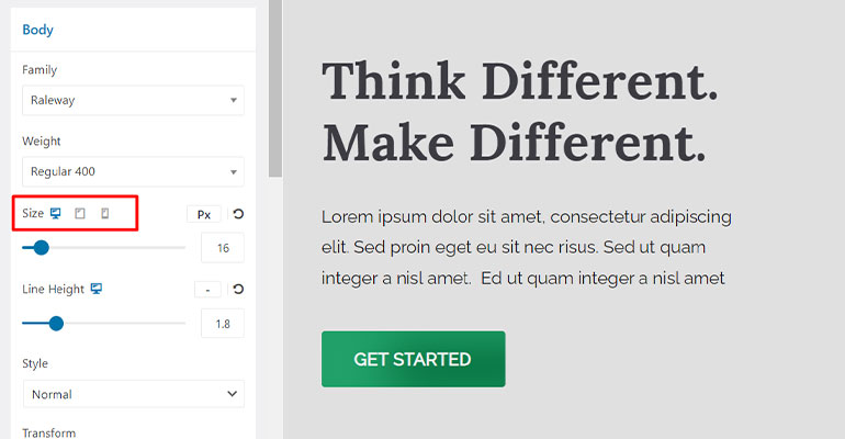
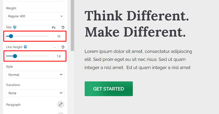
- Responsive Switcher Settings: This setting is enhanced with a slider control option along with the direct font size input option. You can hover your mouse and click on the required device icon to adjust and configure the settings accordingly.
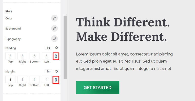
- Input Binding Settings: It’s a new setting to enable you to bind your input values in all inputs while setting dimensions.
- Reset Settings: It’s yet another new setting introduced. It allows you to revert your settings back to default and re-configure it.
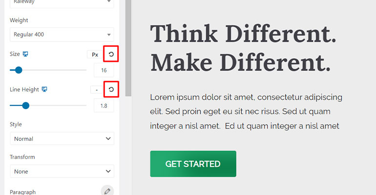
- Typography Settings: Formerly, the users had to input the values to configure font size, line height, letter spacing, etc. But now, it’s replaced by a convenient slider control option that enables you to configure the typography settings smoothly.
- Subtitle Control: It’s a newly launched setting option to grant you full control over the subheadings.
- Background Control: The design of the color picker and image upload section has also been enhanced in the Background Control option.
- Color Control: The color picker, interactive saturation slider, and color palette have undergone a comprehensive design overhaul.
- Sortable Control: There’s an improvement to the design, such as replacing the hide/show eye icons with a toggle control. Additionally, the arrangement has been enhanced with draggable elements and clear labeling.
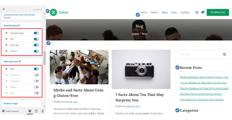
10. Radio Images: We’ve also enhanced the design of the Radio Image icons for clarity.
C. Customizer Option Refactor
We wanted to ensure that our users can effortlessly navigate and locate the necessary theme settings to customize their site according to their preferences.
That’s why we’ve also restructured and consolidated different customizer settings, grouping relevant options in a single location for easy access.
Here’s a list of the customizer options we’ve revamped in Zakra 3.0:
Global
- Colors: All the color controls for the header, link, base, etc., have been relocated under a Color section for easy access.
- Container: The Background section has been included within the Container section while the Container layouts are moved to its extended section, Content Area.
- Content Area: This section provides Bordered and Boxed layout options for the content.
- Sidebar: Additional Default layouts have been added to manage the entire area’s sidebar seamlessly. When a specific area’s sidebar is set to default, the chosen default layout is applied automatically.
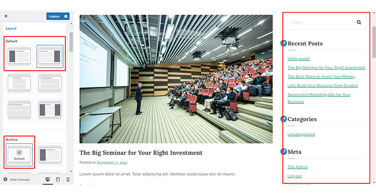
Header & Navigation
- Site Identity: The options under this section have undergone significant rearrangements for placing the respective control together for your convenience. Moreover, you can now control the site title and tagline individually, unlike the previous setting options.
- Top Bar: A new layout option for the top bar offers you two choices: Layout 1 (single-column layout) and Layout 2 (two-column layout). Further, a new alignment style has been introduced to complement the new Layout 1.
- Button: The Header Button and Header Button Two has been consolidated within the Button section. So, you can now choose which of the respective buttons you want to display on your website.
- Drawer Menu: The Drawer Menu has been separated from the previous Header Main Area section and relocated to a newly created section. This dedicated section lets you to customize the appearance and behavior of the drawer menu conveniently.
- Sticky Header: The toggle option to enable Sticky Header has been replaced with the Enable layouts. Thus, you can now choose the None option to disable the Sticky Header or select another option to enable the functionality.
- Transparent Header: We’ve enhanced the control settings for enabling Transparent Header feature on 404, search, archive pages, and the front page. Rather than a single toggle, we’ve introduced checkboxes for each page allowing independent enabling or disabling of features for specific pages.
- Page Header: The Page Header option has been relocated to Header & Navigation from the Content section. It enables you to control both the page header and page title. And you also efficiently customize the header’s layout, background, typography, etc., from here.
- Primary Menu: The previous subsections of Menu have been consolidated into a single section called Primary Menu. Moreover, the options are rearranged with the updated controls.
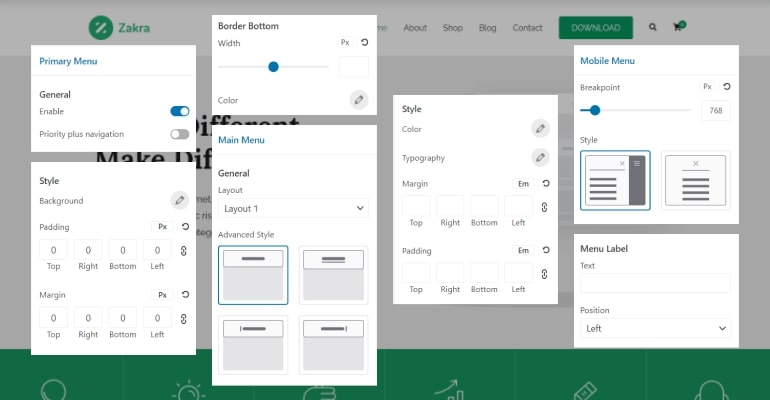
Besides, several Content and Footer components have also been reorganized and grouped together to ensure easy navigation and convenient customization for our users.
D. Code Refactor
Adhering to the latest coding standards is essential for eliminating compatibility issues with underlying software like WordPress and other plugins and tools.
It’s also important to minimize possible vulnerabilities and security breaches.
That’s precisely why we’ve refactored the Zakra code following the latest coding standards.
Various code refactors and updates for the latest Zakra theme are enlisted below:
- Well-managed SASS folder structure
- Consistent HTML markup and CSS classes throughout the theme
- Consistent theme file/folder structure, PHP classes
- Replacement of Float with Flex/Grid property for improved layout control, responsiveness, and cross-browser compatibility
- Mobile-first CSS for responsiveness and adaptive designs
- Utilization of CSS variables for enhanced theme flexibility
- Replacement of Font Awesome and PNG icons with SVG icons for an improved speed
Troubleshooting Common Issues Following Zakra 3.0 and Pro 2.0 Updates
While updating to Zakra 3.0 and Pro 2.0, you might run into some design issues such as unnatural font size, icons, lack of styling, and so on.
You may encounter these common issues due to caching problems (broken design) and migration issues.
1. Caching Problem (Broken Design)
If you update the theme and it’s taking time to display the latest design, it probably might be due to two major reasons.
Thus, to fix this issue, you need to clear the cache:
- If you’ve used caching plugin, clear the cache using the plugin’s settings.
- If the above method doesn’t work, request your hosting company to clear the cache.
2. Migration Issues
If you’ve imported and customized any of the Zakra demos previously and are experiencing design issues after updating to the latest Zakra version, there is a simple solution.
Just click on the “Fix Data Migration” notice that appears on your dashboard, and it’ll fix the problem.
If you encounter any inconvenience, please feel free to reach out to our customer support team.
Ready to Discover the Power of Zakra 3.0 and Pro 2.0?
With our newest Zakra version, you can experience a seamless website-building experience like never before.
Don’t believe our words? Try it for yourself.
If you’re already a Zakra user, this update is free! You can easily upgrade to Zakra 3.0 with a click right from your WordPress dashboard.
And if you haven’t yet experienced Zakra, this is the right time to do so. With Zakra 3.0, you can craft beautiful websites of any niche and improve your online presence.
For more advanced features, you can also upgrade to Zakra Pro.
Looking for help? Got some queries? Feel free to contact us here. Remember, we’re here for you.
Lastly, don’t forget to stay connected with us on Facebook and Twitter.
