Say what you will about the block editor, but one thing it’s allowed many casual WordPress users to do, is customize their websites without having to rely on page builder plugins as they did in the classic editor days. While overall opinions on the Gutenberg editor range from “it’s the best thing ever” to “a vicious attack on humanity,” even the naysayers can’t deny that there are so many elements you can add now with just the core WordPress blocks that you couldn’t before. One of those elements is a background cover image.
Not only is there a dedicated “cover block” solely made for this purpose, but it takes a minute (at most) to add it to your posts. That’s not an exaggeration. The other nice thing about it is its versatility. You can easily add cool effects with just a few clicks. In this guide I’ll show you how to add a background image using the cover block and then I’ll teach you a few ways you can customize it – including how to add the parallax effect. Let’s get into it!
How to use the cover block to add a background image
As long as you know how to use the WordPress block editor, then you can probably hold your breath and get this done before you run out of circulating oxygen in your system. (Disclaimer: I’m not responsible if you pass out. Proceed at your own risk.)
All you need to do is click on the + sign inside of whatever post you’d like to add the background image to. Then when the search popup box comes up, type in “cover:”
As you can see above, the cover block comes with three options to add an image file to serve as your background image:
- Upload one from your hard drive.
- Choose an already-uploaded one from your media library.
- Use the featured image of the post.
Pick whichever one you want and you’ll see it rendered. You’ll also notice that a paragraph block will be layered on top of it with a prompt for you to write something. Hence why it’s a background image because the foreground is the text.
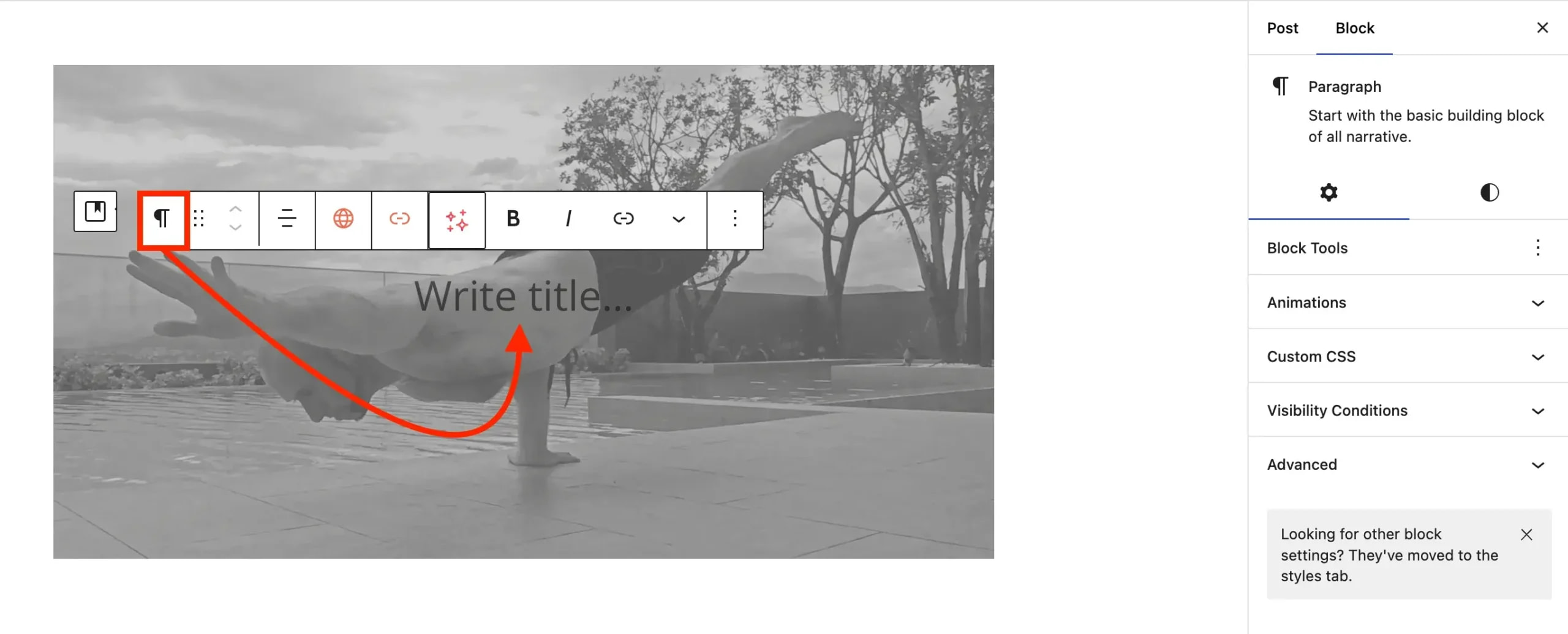
If you plan on using this image and the text as a heading to start off a new section of your post, you can also change the paragraph block into a heading block and adjust it from H2 to H3 to H4 and so on.
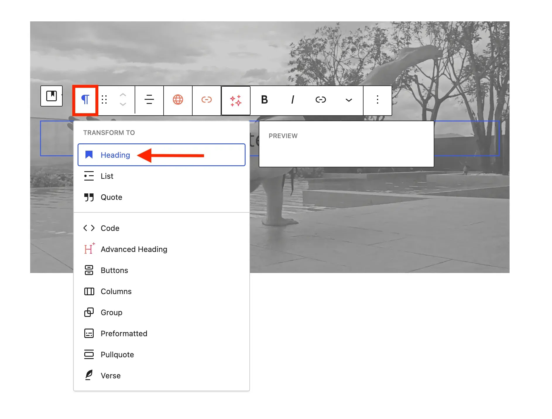
And that covers the basics of using the cover block to add a background image to your posts. If you’re still holding your breath, you can stop now. 😉
Before I let you go though, let me show you a few other quick modifications you can make to get the most out of the cover block.
How to customize the background image
There are several things that I usually tweak after getting the basics out of the way and I figure that you might want to tweak them as well. These are:
- Color of the overlay
- Opacity of the overlay color
- Color of the overlay text
- Width of the cover block (and background image)
- Parallax effect
Edit the overlay details
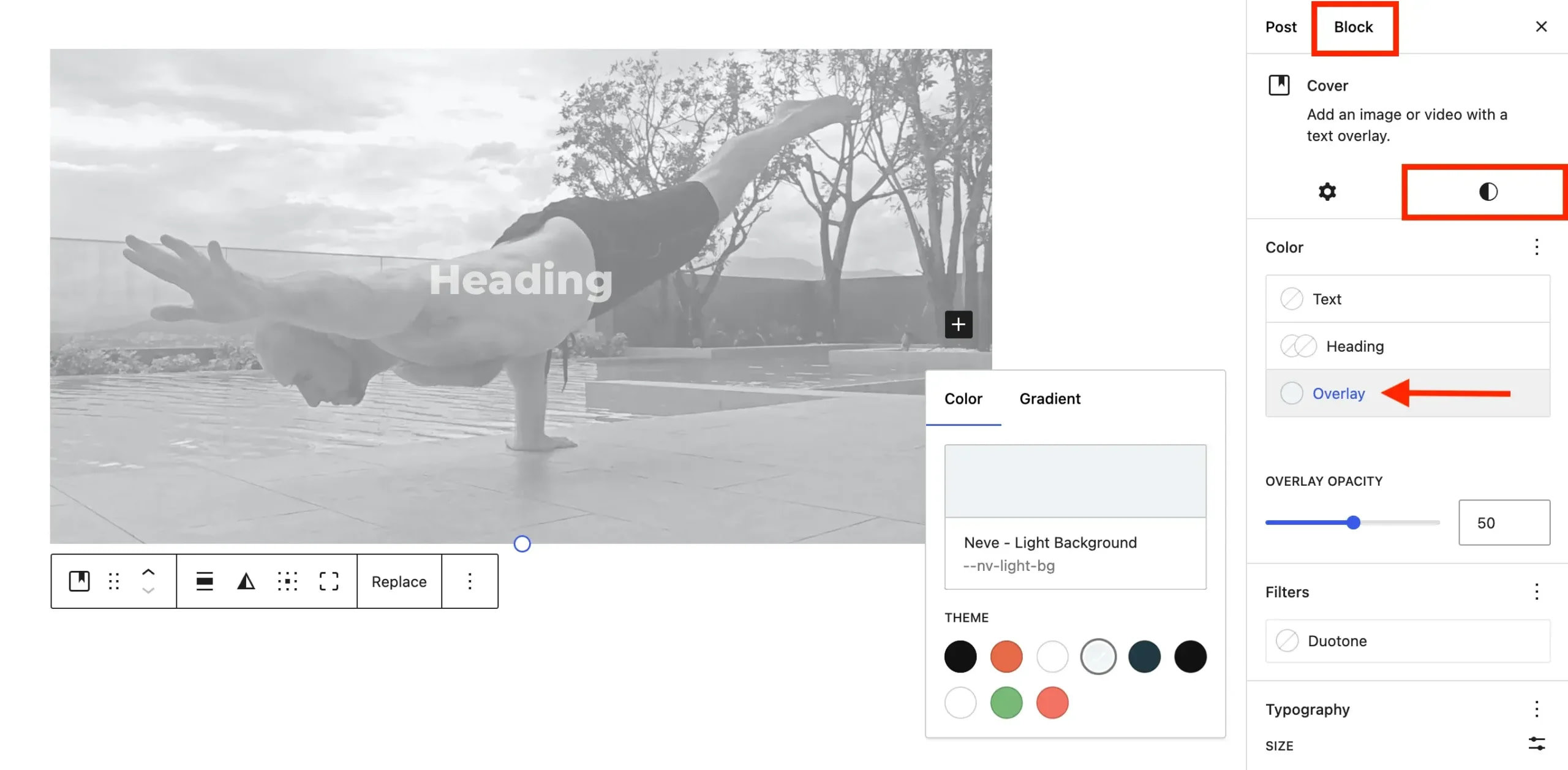
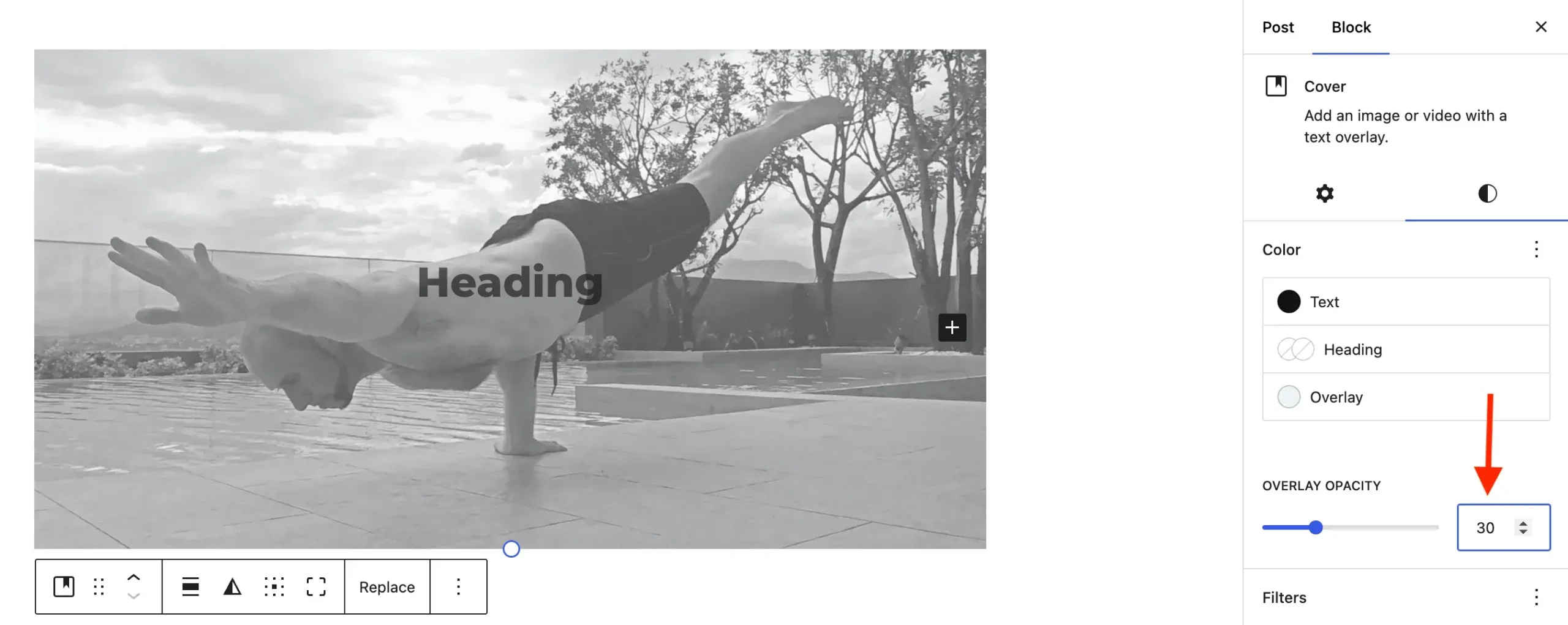
The first three adjustments can all be made from the Styles tab on the righthand side of the block editor. Just make sure that you are on Block ✅ and not Post ❌ and then tap the little half-moon icon.
From there you can click on Overlay to choose the color that you want laid over the background image. There are some default colors that come with whatever theme you are using, but if you want to add your own custom color, you can tap on the rectangle box above the color choices.
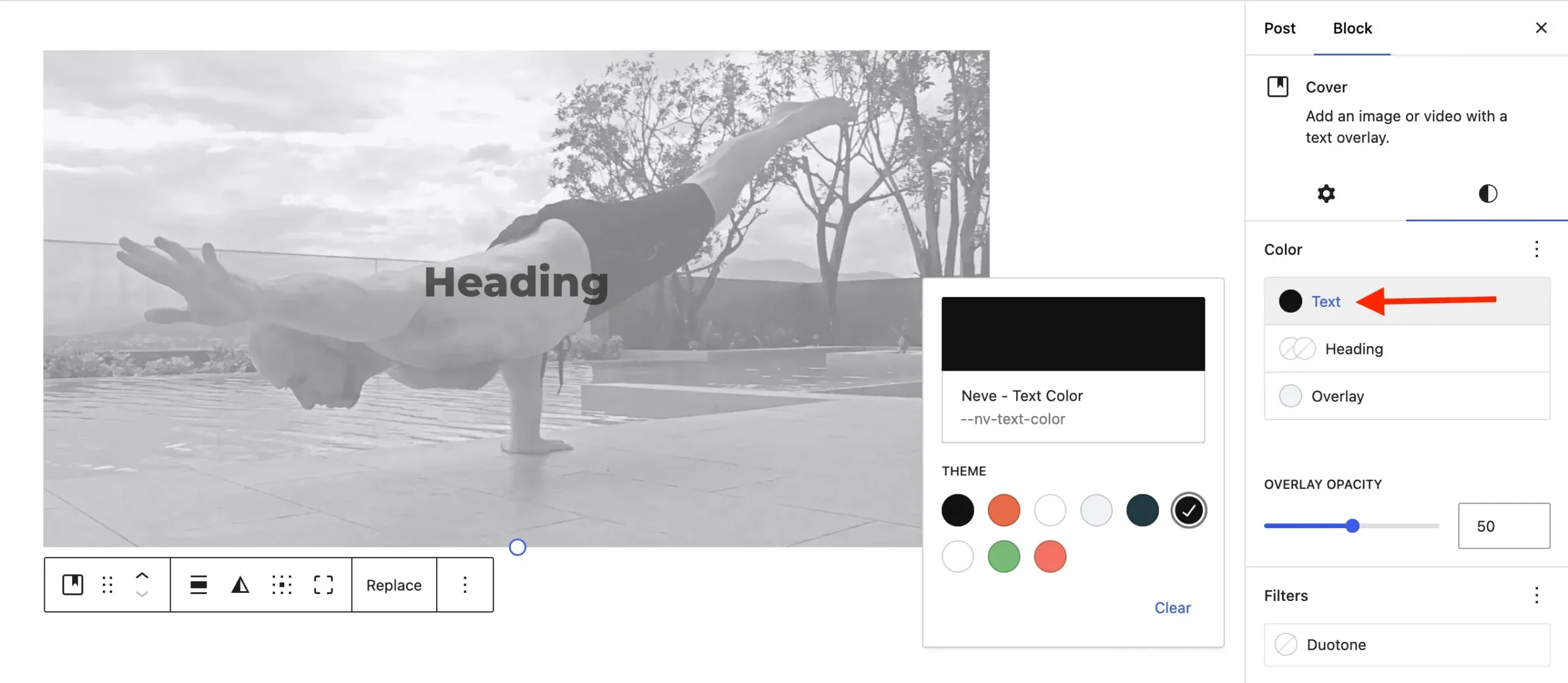
To change the color of the text overlay, simply click on Text. The same rules apply as above.
The overlay opacity is just below those options, which you can toggle with either the slider, the up/down arrows, or manually write in a value in the box:
Now that you know how to tweak those three things, it’s time to look at how to adjust the width of the cover block and how to create the popular parallax effect.
Edit the width and turn on parallax
From the Styles tab (the small half-moon icon) click back over to the left, which will bring you to the Settings tab (the small cogwheel icon).
To adjust the width, click on the cover block. Then in the popup menu, look for the icon that shows a fat line in between two thin lines. Tap on it to open up the width choices.
Finally, to add the parallax effect, look for the toggle that says Fixed background and turn it on:
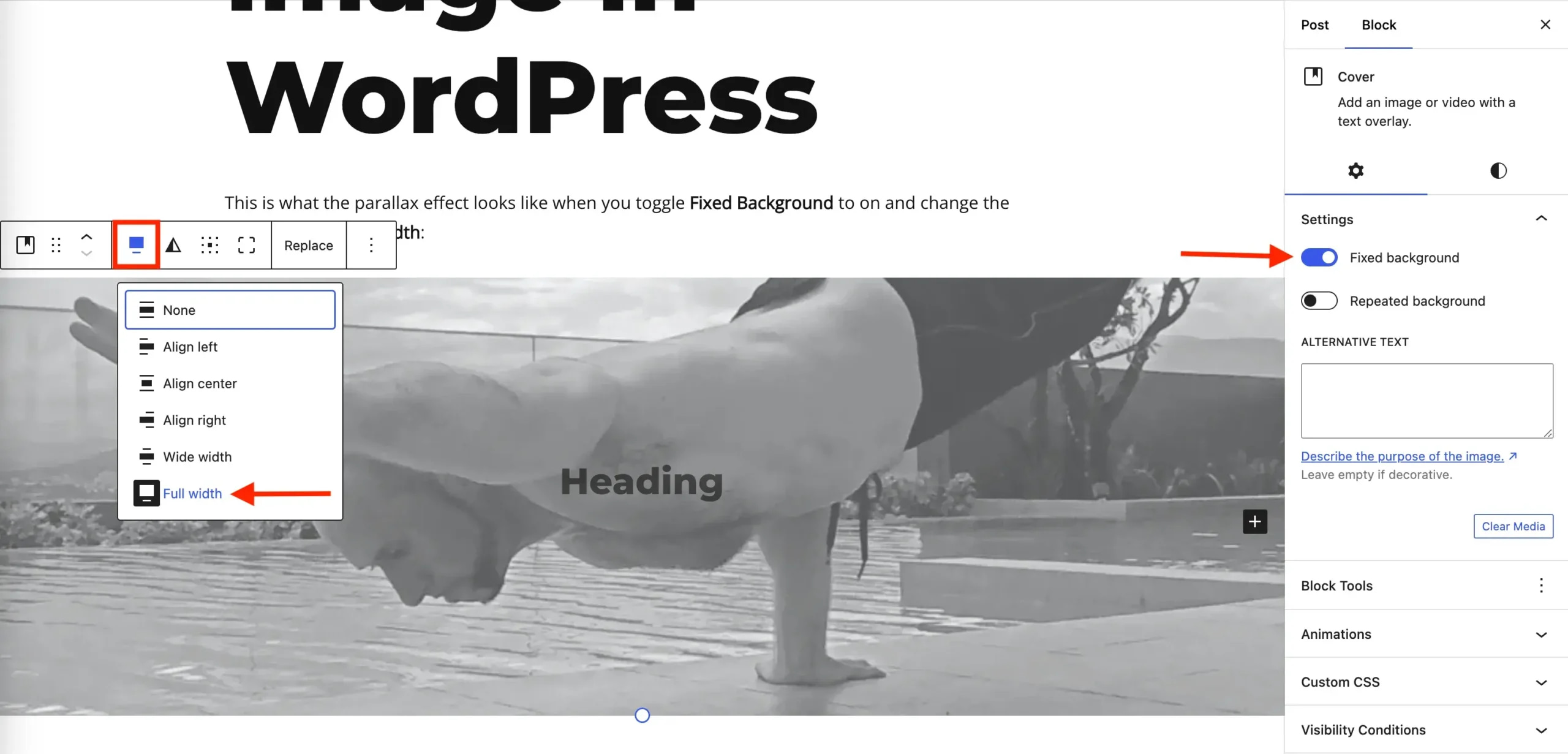
If you do plan on adding the parallax effect, I recommend going with full width for the background image. I think it looks better, but that’s my personal preference. If you want a different width then by all means do whatever is best for you. In case you’re curious, here’s what it looks like on the frontend:
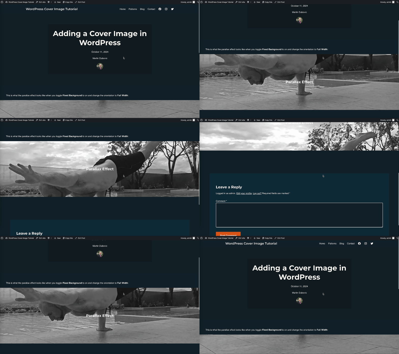
⚠️ If for some reason your background image doesn’t stretch to full width even after toggling the width of the cover block (as shown above), it means that global style settings are overriding it. In that case, you’ll need to edit those, but that’s outside the scope of this tutorial. If you’re not sure how to do it, I recommend heading over to our sister site to check out this guide on editing your theme. It’ll point you in the right direction.
Final thoughts
And there you have it ladies and gents. Not too complicated, right?
As I stated in the intro, for all its faults, there’s no denying that the block editor has made it easier to do many things in WordPress. In the pre-block era, a novice WordPress user would’ve needed either a page builder or some one-function plugin just to do what I showed you here. Those days are over.
Now you can add background images to WordPress and even the parallax effect in only a few clicks. If you have some time, I encourage you to check out our full guide on how to use the block editor. It’ll give you some additional insights on what’s possible with WordPress.
Do you have any questions? Let me know in the comments below. I’ll be glad to help you out.
…
Don’t forget to join our crash course on speeding up your WordPress site. Learn more below:
Or start the conversation in our Facebook group for WordPress professionals. Find answers, share tips, and get help from other WordPress experts. Join now (it’s free)!
