In 2018, WordPress introduced the Gutenberg editor with version 5.0, bringing a new way to build pages and posts using “blocks.” At first, these blocks were pretty basic, but over the years, they’ve evolved to offer more flexibility and a better editing experience.
Still, there are times when a block doesn’t quite do what you need. Maybe you want to remove certain features, add new ones, apply a specific style by default, or make some settings easier to access. In cases like this, creating a custom block from scratch might seem like an option, but — let’s be honest — it’s overkill for small tweaks. Wouldn’t it be easier if you could just modify blocks that already exist?
That’s where the Blocks API comes in. This article explains how to extend core WordPress blocks using the Blocks API, providing practical examples that can be used in real-world projects.
Understanding the WordPress Blocks API
The WordPress Blocks API is the foundation of the block editor, allowing developers to create, modify, and extend blocks. The API provides various ways to interact with blocks. You can:
- Modify block settings — Change block attributes, default values, and behaviors.
- Add or remove block supports — Enable or disable features like typography, colors, and spacing.
- Inject custom controls — Add new options inside the block settings panel.
- Create block variations — Make pre-configured versions of existing blocks to speed up content creation.
Every block in WordPress, whether it’s a Paragraph, Image, or Button block, is defined by a set of attributes and settings stored in a block.json file. This file contains metadata about the block, including its name, category, default attributes, and the features it supports.
WordPress allows you to modify these values using either PHP or JavaScript, but this article explains how to use filter hooks in the Blocks API. This ensures your modifications are registered on the server without needing to enqueue additional JavaScript files.
For example, if you want to enable or disable certain features of a block, the best way to do it is by using the register_block_type_args filter in PHP. This method allows you to tweak block settings dynamically without modifying the block.json file directly.
Modifying block supports
WordPress blocks come with predefined supports, which control the editor’s options. Some blocks, like the Image block (core/image), have duotone filters enabled by default, allowing users to apply color overlays.
However, the Media & Text block (core/media-text) does not support duotone out of the box, even though it allows users to insert an image. This means that while you can apply a duotone filter to a standalone Image block, you can’t do the same when an image is placed inside a Media & Text block.
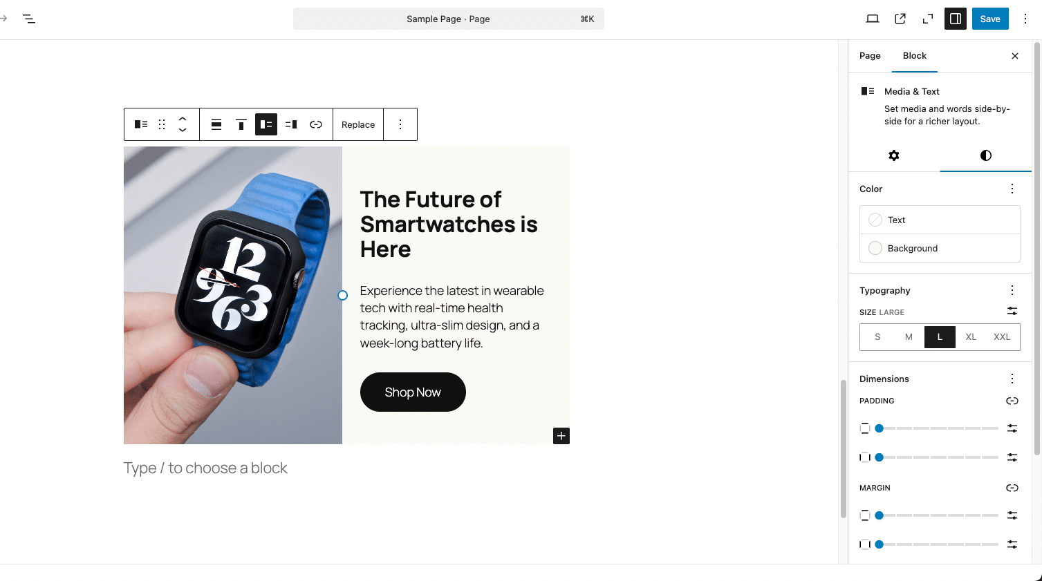
Since the Media & Text block can contain an image, enabling duotone filters makes sense. We can do this by modifying its supports array and specifying the correct CSS selector so the filter applies correctly. We can enable it using the register_block_type_args filter in PHP.
Add the following code to the functions.php file of your theme:
function enable_duotone_for_media_text_block($args, $block_type) {

	// Only modify the Media & Text block
	if ( 'core/media-text' === $block_type ) {
		$args['supports'] ??= [];
		$args['supports']['filter'] ??= [];
		$args['supports']['filter']['duotone'] = true;

		$args['selectors'] ??= [];
		$args['selectors']['filter'] ??= [];
		$args['selectors']['filter']['duotone'] = '.wp-block-media-text .wp-block-media-text__media';
	}

	return $args;
}
add_filter('register_block_type_args', 'enable_duotone_for_media_text_block', 10, 2);
The code above enables the duotone filter inside the supports array and defines the correct CSS selector to apply the duotone effect to images inside the Media & Text block. The add_filter() function uses 10 as the priority (when the filter runs) and 2 to specify the number of arguments passed ($args, $block_type).
When you save the file and reload, you should see the Duotone controls available in the Filters section.
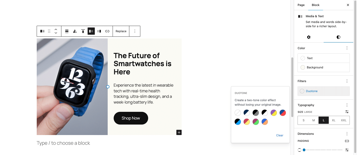
Enabling duotone for the Media & Text block using register_block_type_args is an effective way to modify block behavior dynamically. However, WordPress provides another method for modifying block settings: overriding block metadata using block_type_metadata.
Both approaches allow you to customize blocks, but they work at different stages of the block registration process.
For example, let’s say we want to adjust the Paragraph block (core/paragraph) so that it only supports margin adjustments and disables padding. One way to do this is by using register_block_type_args:
function modify_paragraph_spacing_args($args, $block_type) {
    if ($block_type === 'core/paragraph') {
        $args['supports']['spacing'] = [
            'margin' => true,
            'padding' => false
        ];
    }
    return $args;
}
add_filter('register_block_type_args', 'modify_paragraph_spacing_args', 10, 2);
This method works well in most cases, but since it modifies the block after it has already been registered, it can sometimes be overridden by other plugins or themes that modify the same block later in the process.
A more structured approach in this case could be to override the block’s metadata directly using block_type_metadata:
function mytheme_modify_paragraph_spacing($metadata) {
    if ($metadata['name'] === 'core/paragraph') {
        $metadata['supports']['spacing'] = [
            'margin' => true,
            'padding' => false
        ];
    }
    return $metadata;
}
add_filter('block_type_metadata', 'mytheme_modify_paragraph_spacing');
Neither approach is inherently better than the other — it just depends on when you want to modify the block and how persistent you want the change to be.
Registering block styles
Many WordPress blocks come with predefined styles that users can select in the editor. A good example is the Image block (core/image), which includes a Rounded style by default. However, the default rounded corners are often too extreme, making the image look more like an oval than a neatly styled element.
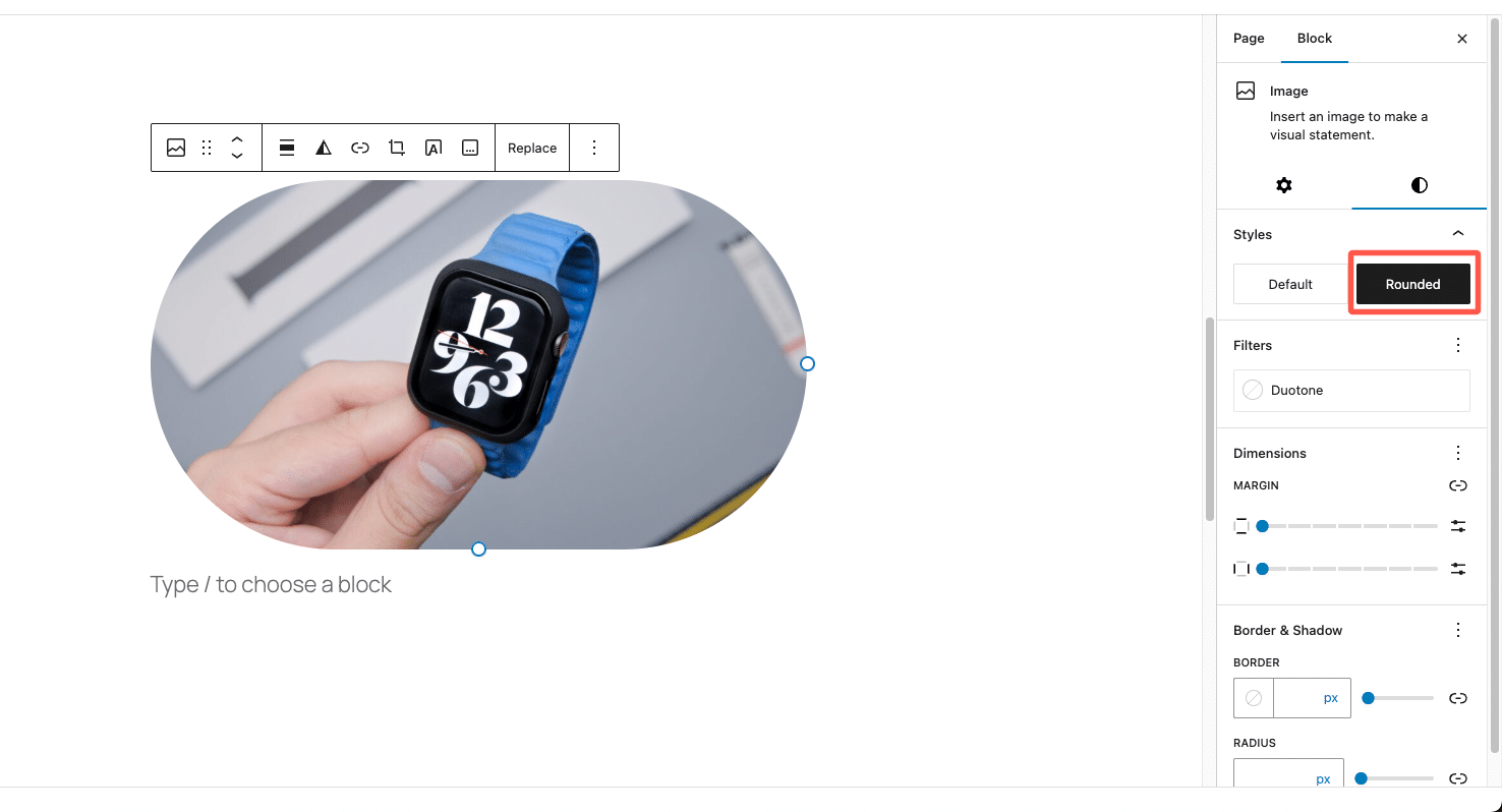
Instead of manually adjusting the border radius for each image, a better approach is to customize the rounded style so it applies a more refined corner radius — perhaps adding a subtle shadow for a modern look. This way, users can simply click a button to apply a well-designed style without needing to manually tweak settings every time.
Let’s take the Rounded style in the Image block and customize it so that the corners are slightly rounded instead of excessively curved, and a subtle box shadow is added for a more polished look.
Since the block editor allows registering and unregistering block styles, we can remove the default Rounded style and replace it with a custom version.
Here’s how to do it:
function modify_image_block_rounded_style() {
    // Remove the default "Rounded" style
    unregister_block_style( 'core/image', 'rounded' );

    // Register a new "Rounded" style with custom CSS
    register_block_style(
        'core/image',
        array(
            'name'         => 'rounded',
            'label'        => __( 'Rounded', 'your-text-domain' ),
            'inline_style' => '
                .wp-block-image.is-style-rounded img {
                    border-radius: 20px; /* Adjust this value */
                    box-shadow: 0px 4px 6px rgba(0, 0, 0, 0.1); /* Optional shadow */
                }
            ',
        )
    );
}
add_action( 'init', 'modify_image_block_rounded_style' );
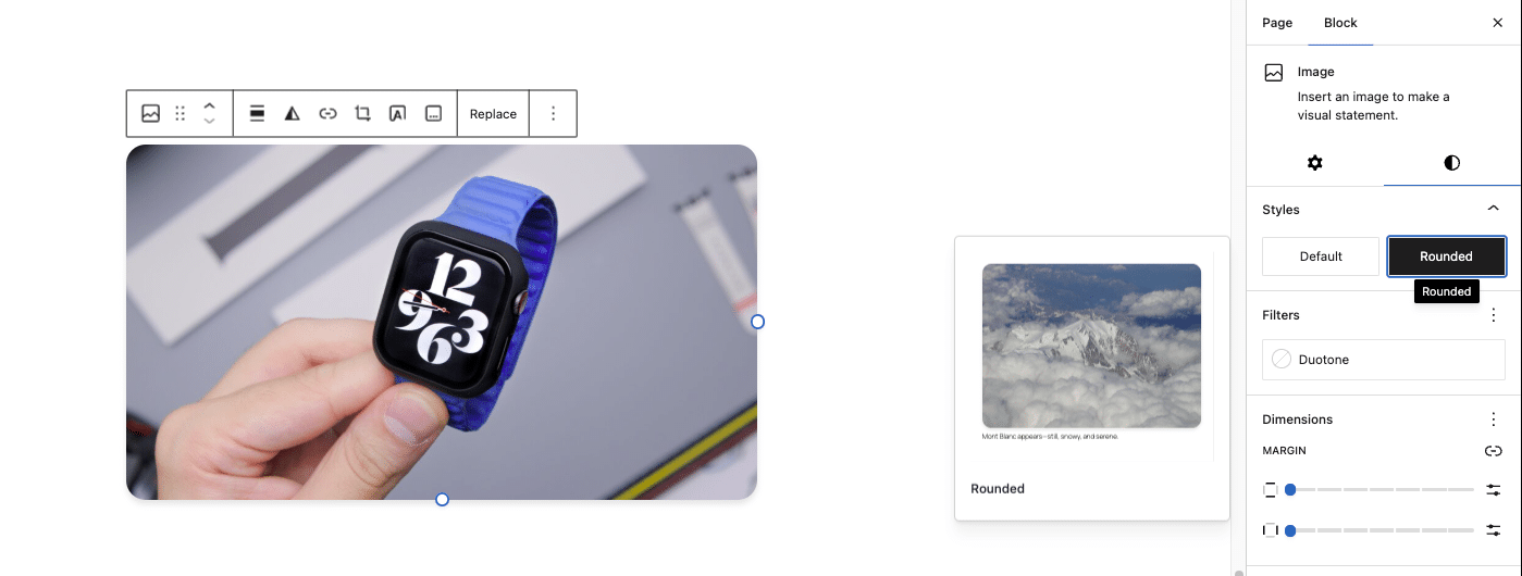
The code replaces the default overly-rounded style with a refined version that applies border-radius: 20px; for softer corners and box-shadow for a subtle lift.
Using an external CSS file instead of inline styles
While inline style works well for simple styles, it’s not ideal for maintainability. A better approach is to define styles in an external CSS file and enqueue it instead.
To do this, create a new CSS file, e.g., custom-block-styles.css, and add this to it:
/* Custom Rounded Image Block Style */
.wp-block-image.is-style-rounded img {
    border-radius: 20px; /* Adjusted rounded corners */
    box-shadow: 0px 4px 6px rgba(0, 0, 0, 0.1); /* Subtle shadow */
}
Next, enqueue the CSS file in functions.php:
function enqueue_custom_block_styles() {
    wp_enqueue_style(
        'custom-block-styles',
        get_template_directory_uri() . '/css/custom-block-styles.css',
        array(),
        '1.0'
    );
}
add_action('wp_enqueue_scripts', 'enqueue_custom_block_styles');
add_action('enqueue_block_editor_assets', 'enqueue_custom_block_styles');
Now, instead of using inline style, you can register the style without embedding CSS directly in PHP:
register_block_style(
    'core/image',
    array(
        'name'  => 'rounded',
        'label' => __( 'Rounded', 'your-text-domain' ),
        'style_handle' => 'custom-block-styles'
    )
);
This way, you can modify styles without touching PHP.
Registering block variations
Block variations let you create predefined versions of a block with custom settings, making it easier for users to apply consistent designs with a single click. Instead of modifying a block’s settings manually each time, a variation allows you to insert a block that already has the right attributes, styles, or configurations applied.
Some core WordPress blocks actually work this way. The Embed block isn’t a single block — it’s a set of variations for different platforms like YouTube, Twitter, and Spotify. The Row block, and Stack block are also just variations of the Group block, each with different layout settings.
This approach keeps things modular, allowing WordPress to provide tailored experiences while using a shared underlying structure.
Creating a Testimonial variation of the Quote block
While WordPress doesn’t have a dedicated Testimonial block, the Quote block (core/quote) can be adapted to serve that purpose. Instead of making users manually add an image, align the text, and format everything, we can define a Testimonial variation of the Quote block.
This variation automatically includes an Image block, a Quote block, and two Paragraph blocks for the person’s name and company. This ensures every testimonial follows the same structured format without requiring extra adjustments.
To register a block variation in WordPress, we use registerBlockVariation() in JavaScript. Since block variations are handled on the client side, we need to enqueue a JavaScript file that registers our custom Testimonial variation.
To implement this, create a JavaScript file (like custom-block-variations.js) that defines the Testimonial variation of the Quote block. You can create this file in your theme’s assets/js/ directory and add the following code:
wp.domReady(() => {
    wp.blocks.registerBlockVariation(
        'core/quote',
        {
            name: 'testimonial',
            title: 'Testimonial',
            description: 'A variation of the Quote block for testimonials.',
            category: 'text',
            attributes: {
                className: 'is-style-testimonial',
            },
            innerBlocks: [
                ['core/image', { align: 'center', width: 100, height: 100 }],
                ['core/quote'],
                ['core/paragraph', { placeholder: 'Name', align: 'center', fontSize: 'medium', className: 'testimonial-name' }],
                ['core/paragraph', { placeholder: 'Company / Role', align: 'center', fontSize: 'small', className: 'testimonial-company' }]
            ],
            scope: ['inserter'],
        }
    );

    // Inject inline styles for the editor preview
    const style = document.createElement('style');
    style.innerHTML = `
        .wp-block-quote.is-style-testimonial {
            background-color: #f9f9f9;
            padding: 24px;
            border: none !important;
            border-radius: 8px;
            text-align: center;
            font-size: 1.2em;
            font-style: normal;
            color: #333;
            box-shadow: 0px 4px 10px rgba(0, 0, 0, 0.1);
            display: flex;
            flex-direction: column;
            align-items: center;
        }

        .wp-block-quote.is-style-testimonial p {
            margin-bottom: 12px;
            font-size: 1.1em;
        }

        .wp-block-quote.is-style-testimonial cite {
            font-weight: bold;
            display: block;
            margin-top: 10px;
            color: #0073aa;
        }

        .wp-block-quote.is-style-testimonial .wp-block-image {
            display: flex;
            justify-content: center;
            margin: 0 auto 12px;
        }

        .wp-block-quote.is-style-testimonial .wp-block-image img {
            width: 100px;
            height: 100px;
            object-fit: cover;
            border-radius: 12px;
        }

        .wp-block-quote.is-style-testimonial .testimonial-name {
            font-weight: bold;
            font-size: 1.2em;
            margin-top: 12px;
            color: #222;
        }

        .wp-block-quote.is-style-testimonial .testimonial-company {
            font-size: 0.9em;
            color: #555;
        }
    `;
    document.head.appendChild(style);
});
In the code above, registerBlockVariation() defines the Testimonial variation of the Quote block, preloading an Image block, a Quote block, and two Paragraph blocks for the person’s name and company. The Image block is centered at 100×100 pixels for uniform profile pictures, while the Quote block remains unchanged as the testimonial text.
A custom class (is-style-testimonial) is applied for styling, giving the block a light background, subtle shadow, and centered text. The default left border is removed, and the image keeps its aspect ratio with slightly rounded corners for a polished look.
Next, since the JavaScript file needs to load inside the block editor, we must enqueue it in functions.php.
function enqueue_custom_block_variations() {
    wp_enqueue_script(
        'custom-block-variations',
        get_template_directory_uri() . '/assets/js/custom-block-variations.js',
        array( 'wp-blocks', 'wp-dom-ready', 'wp-edit-post' ),
        filemtime( get_template_directory() . '/assets/js/custom-block-variations.js' ),
        true
    );
}
add_action( 'enqueue_block_editor_assets', 'enqueue_custom_block_variations' );
This ensures the Testimonial block variation appears inside the block editor.
While the JavaScript code ensures the block looks correct in the editor, we also need to apply the styles on the frontend so testimonials display correctly when published. Add the following code to functions.php:
function register_testimonial_block_style() {
    register_block_style(
        'core/quote',
        array(
            'name'  => 'testimonial',
            'label' => __( 'Testimonial', 'your-text-domain' ),
            'inline_style' => '
                .wp-block-quote.is-style-testimonial {
                    background-color: #f9f9f9;
                    padding: 24px;
                    border: none !important;
                    border-radius: 8px;
                    text-align: center;
                    font-size: 1.2em;
                    font-style: normal;
                    color: #333;
                    box-shadow: 0px 4px 10px rgba(0, 0, 0, 0.1);
                    display: flex;
                    flex-direction: column;
                    align-items: center;
                }

                .wp-block-quote.is-style-testimonial .wp-block-image img {
                    width: 100px;
                    height: 100px;
                    object-fit: cover;
                    border-radius: 12px;
                }

                .wp-block-quote.is-style-testimonial .testimonial-name {
                    font-weight: bold;
                    font-size: 1.2em;
                    margin-top: 12px;
                    color: #222;
                }

                .wp-block-quote.is-style-testimonial .testimonial-company {
                    font-size: 0.9em;
                    color: #555;
                }
            ',
        )
    );
}
add_action( 'init', 'register_testimonial_block_style' );
Now, whenever a user inserts a Testimonial block, it already includes the image, quote, name, and company fields, all preformatted and styled correctly. This eliminates the need for manual adjustments, ensuring every testimonial follows the same clean and professional structure.
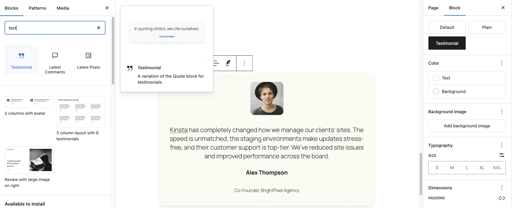
Instead of forcing users to build testimonials from scratch, this block variation provides a streamlined workflow that enhances content creation while maintaining site design consistency.
Advanced use case: Combining the Supports and Styles APIs to create branded buttons
Now that you know what each API can do and how it works, why don’t we push things a little further? Instead of using the Supports API or Styles API separately, we can use them together to solve a single problem: maintaining design consistency while giving users a structured way to apply the right styles.
Let’s consider a real-world scenario. A company wants all buttons on its site to follow strict brand guidelines. They don’t want users picking random colors, changing padding, or applying funky typography. However, they do want flexibility — so users should be able to choose between two pre-approved button styles:
- Primary Button — The main call-to-action button, with a solid background and bold styling.
- Secondary Button — A more subtle, outlined button typically used for secondary actions.
To achieve this, we need to:
- Use the Styles API to define the two button styles.
- Use the Supports API to remove unnecessary settings, ensuring users don’t manually override branding by changing colors, spacing, or typography.
By combining both APIs, we allow structured choices while preventing users from breaking the design system.
Step 1: Define custom button styles
Start by adding the following code to the functions.php file:
function register_custom_button_styles() {
    register_block_style(
        'core/button',
        array(
            'name'  => 'primary-button',
            'label' => __( 'Primary Button', 'your-text-domain' ),
            'inline_style' => '
                .wp-block-button.is-style-primary-button .wp-block-button__link {
                    background-color: #4D4D4D;
                    color: #ffffff;
                    padding: 12px 24px;
                    border-radius: 4px;
                    font-size: 1em;
                    font-weight: 500;
                    text-transform: none;
                    box-shadow: 2px 2px 6px rgba(0, 0, 0, 0.1);
                }
            ',
        )
    );

    register_block_style(
        'core/button',
        array(
            'name'  => 'secondary-button',
            'label' => __( 'Secondary Button', 'your-text-domain' ),
            'inline_style' => '
                .wp-block-button.is-style-secondary-button .wp-block-button__link {
                    background-color: transparent;
                    color: #4D4D4D;
                    padding: 12px 24px;
                    border: 1px solid #4D4D4D;
                    border-radius: 4px;
                    font-size: 1em;
                    font-weight: 500;
                    text-transform: none;
                    box-shadow: none;
                }
            ',
        )
    );
}
add_action( 'init', 'register_custom_button_styles' );
Now, when users insert a Button block, they see Primary Button and Secondary Button as style choices.
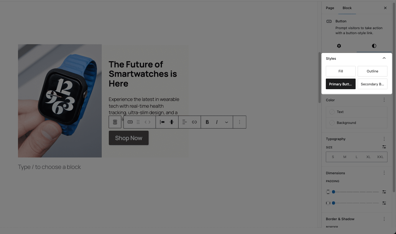
The primary button has a solid dark gray background, while the secondary button has a transparent background with a border. Both buttons have consistent padding, border radius, and font styling, ensuring a professional appearance across the site.
Step 2: Restricting Button Customization
While the button styles are now predefined, users could still manually override them using WordPress’s block editor settings. If they change the colors, padding, or typography, the buttons may no longer match the brand guidelines.
We can use the Supports API to disable these customization options, preventing users from making unintended changes. Add this to functions.php:
function restrict_button_customization($args, $block_type) {
    if ($block_type === 'core/button') {
        // Disable specific color settings (text, background, link)
        $args['supports']['color'] = [
            'text'       => false,
            'background' => false,
            'link'       => false,
        ];

        // Disable typography settings (font size, font weight, line height)
        $args['supports']['typography'] = false;

        // Disable spacing settings (padding, margin)
        $args['supports']['spacing'] = false;

    }
    return $args;
}
add_filter('register_block_type_args', 'restrict_button_customization', 10, 2);
With this in place:
- Users can’t change button colors, so all buttons must adhere to the brand’s color scheme.
- Typography controls are removed, keeping text formatting consistent.
- Spacing adjustments are disabled, preventing users from modifying padding and margins.
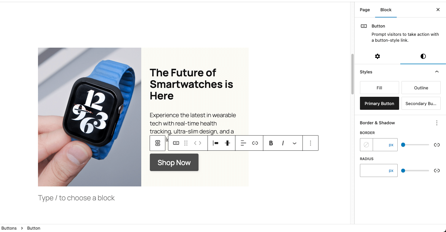
Now, instead of letting users create a random mix of button styles, they’ll simply choose between primary and secondary styles, keeping the design professional and structured.
Summary
We’ve only scratched the surface of what’s possible with WordPress block customization. WordPress provides a vast collection of APIs that make it easy to extend and customize blocks, allowing developers to tailor the editor experience while keeping things structured and user-friendly.
If you’re serious about mastering block customization, there’s so much more to explore. Check out the official WordPress developer documentation, attend WordCamps and meetups, and keep learning from great resources like the Kinsta blog, where we regularly break down advanced WordPress concepts.
Of course, having a solid hosting provider makes experimenting with these changes effortless. Whether you’re testing out new block modifications or managing a high-traffic site, reliable hosting ensures smooth performance and easy scalability. At Kinsta, we’ve built our platform to handle exactly that. In fact, we were recently ranked #1 in WordPress Hosting by G2, thanks to over 930 customer reviews.
This speaks for itself: You can trust us to power your WordPress experience.


