Have you ever wondered what makes some websites a joy to navigate while others leave you feeling lost? That’s because some sites are well-structured and improve the overall user experience.
Creating a website is more than just putting together pages—crafting a seamless and intuitive experience for your visitors.
A well-thought-out website structure improves user experience and boosts your site’s visibility in search engines.
So, without any further ado, let’s get started.
1 What is a Website Structure?
A website structure refers to the organization and layout of a website’s content, pages, and navigation elements.
It determines how information is categorized, linked, and presented to visitors. An effective website structure enhances user experience and is important in search engine optimization (SEO) as it helps search engines find and index all your site’s pages.
2 Why is Website Structure Important?
The site structure serves as the backbone of a positive user experience.
Imagine navigating through a website where finding information is like searching for a needle in a haystack.
A well-organized site structure ensures your audience can easily locate what they want, leading to a seamless and satisfying user journey. From intuitive navigation menus to logical content grouping, a properly designed structure enhances user satisfaction, encourages exploration, and keeps your visitors returning.
Here’s how we prefer a simple website structure so that our users can easily navigate through our website.
Also, site structure is an important factor that search engines consider when determining the relevance and ranking of web pages. A well-organized site with clear hierarchies, navigation, and strategic use of keywords makes it easier for search engine algorithms to crawl and index content.
3 Understanding the Elements in Website Structure
The fundamentals of site structure are the building blocks that shape the overall design, accessibility, and user experience of a website.
Let’s explore these fundamental aspects of a website structure in detail.
3.1 Basic Elements
Below, we’ve discussed the basic elements of the website structure.
Homepage
The homepage serves as a snapshot of what the site has to offer. It is your audience’s first point of contact and sets the tone for their interaction with the site.
For instance, a news website’s homepage might feature breaking headlines, featured stories, and multimedia content to engage visitors from the outset.

Navigation Menus
Navigation menus are the navigational backbone of a website, providing your audience with a roadmap to explore different sections.
Commonly found at the top or side of a page, these menus offer links to key areas such as About Us, Services, or Contact.
For a restaurant website, the navigation menu could include sections like Menu, Reservations, Dining, and Events.

Categories and Subcategories
Categories and subcategories organize content into similar groups, facilitating a structured approach to information.
Consider an e-commerce site with categories like Clothing, Electronics, and Home Decor. Within the Clothing category, subcategories may further refine the selection into Men’s, Women’s, and Children’s apparel.

3.2 Hierarchy and Organization
Let us now discuss different hierarchies and organizational structures for the website.
Tree Structure
A tree structure, also known as a hierarchical structure, organizes information in a hierarchical and branching manner. It has a clear and nested arrangement, with a central or root element that branches into various subcategories, creating a tree-like hierarchy.
For instance, consider a corporate website with the following structure:
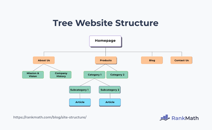
In this example, the homepage serves as the root, branching into sections like About Us and Products, which, in turn, branch into more specific subcategories.
Flat Structure
A flat structure, or a horizontal structure, presents information on the same level without hierarchical layers. It is characterized by a lack of nested subcategories, providing a straightforward and uncomplicated organization.
For instance, an online portfolio can have a flat structure, as described below.
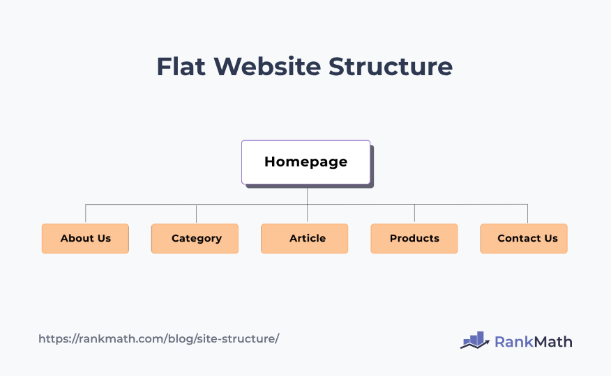
In this case, each section is presented on the same level without nested subcategories, offering a simple and direct navigation experience.
Silo Structure
A silo structure involves organizing information into distinct, self-contained compartments or silos. Each silo typically represents a specific topic or category, and information within a silo may not be readily interconnected with information in other silos.
Imagine a news website with the following silo structure:
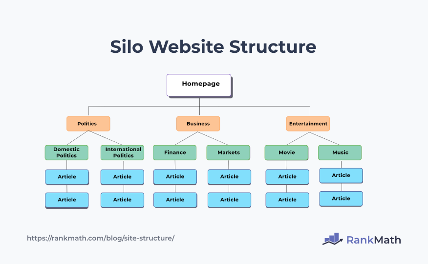
In this scenario, each silo (Politics, Business, Entertainment) is a self-contained unit, and information within each silo is related to its specific topic.
You can refer to our video to create a silo structure for your website.

4 Best Practices to Follow for a Good Website Structure
Now that you’ve understood the elements of website structure, we’ll discuss the best practices you can follow to create a good structure. Let’s get started!
4.1 Homepage Design and Optimization
In website structure, the design and optimization of the homepage are critical elements that significantly influence user engagement and overall success.
Key Content Areas
Key content areas refer to strategically designated sections on the homepage that highlight essential and high-priority information or features. These areas are carefully chosen to capture your visitors’ attention and provide immediate access to the content.
For instance, on an e-commerce platform, key content areas could include “Featured Products,” showcasing popular items, or “New Arrivals,” offering visitors a snapshot of the latest offerings.
By strategically placing these content areas, your website can create a visually compelling and informative homepage that efficiently communicates the key messages to your audience.
Call-to-Action Placement
Call-to-action (CTA) elements encourage your audience to take specific actions, such as purchasing, signing up for newsletters, or exploring further.
The placement of CTAs is an important aspect of homepage optimization, as it guides your audience toward desired interactions and contributes to the website’s overall success.
For instance, a travel website might strategically position a CTA button with a compelling message like “Book Your Adventure Now,” prompting your audience to explore travel packages and initiate the planning process.
4.2 Create a User-Friendly Navigation
Navigation menu design is an important aspect of website structure, influencing how visitors interact with and navigate a site.
There are different types of navigation menus. You can choose the best one that fits your needs and provide a user-friendly experience on your website.
However, you need to be careful with your navigation menu, as some navigation menus can turn out to be spam, and Google might take action against your site.
Dropdown Menus
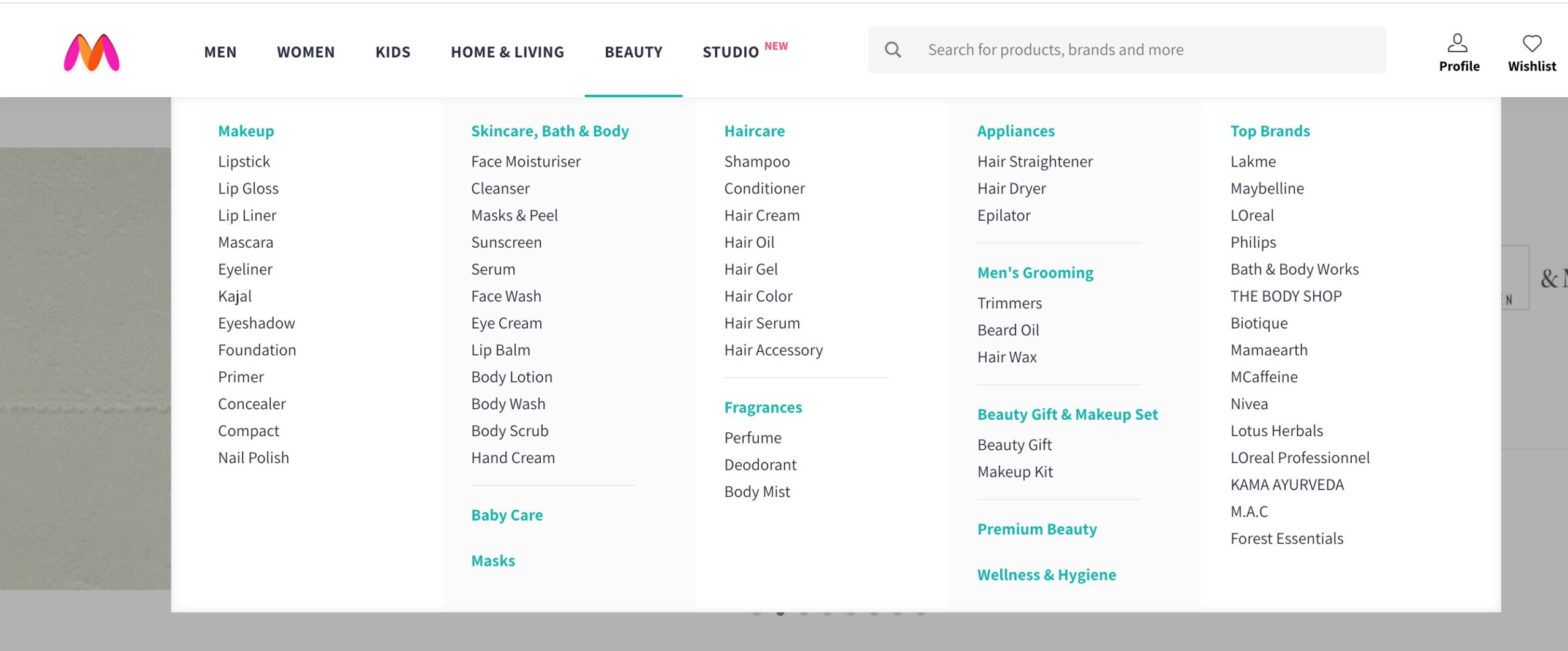
Dropdown menus are a prevalent design feature where subcategories or options appear in a list when the visitors hover over or click on a primary menu item. This design streamlines navigation, providing a space-efficient way to organize and display content categories.
For instance, on an e-commerce platform, the “Beauty” menu might have a dropdown revealing subcategories like “Skincare,” “Haircare,” “Fragrances”, etc.
Hamburger Navigation
The hamburger navigation menu is commonly used in web and mobile interfaces to facilitate a clean, unobtrusive navigation experience.
Named for resembling a hamburger icon—a stack of three horizontal lines—the menu conserves space on the screen by hiding the navigation options behind a compact symbol. When your visitors click or tap on the hamburger icon, a dropdown or slide-out menu reveals the navigation choices.
Footer Navigation
Footer navigation refers to placing navigation links or menus at a web page’s bottom (footer). The footer typically contains links to important pages, legal information, contact details, or other relevant sections.

Including a footer navigation menu ensures your audience can access essential information and features, regardless of where they’re on the website.
4.3 Use Internal Links
Internal linking is a fundamental aspect of website structure that plays a dual role—enhancing user navigation and positively impacting search engine optimization (SEO).
Two critical components of internal linking strategies are anchor text optimization and links for easy navigation. Let’s discuss them in detail.
Anchor Text Optimization
Anchor text optimization involves using descriptive and keyword-rich text for hyperlinks, contributing to user understanding and SEO.
From an SEO perspective, anchor text provides valuable context to search engines, influencing how they interpret and index the linked page.
It is advisable to use descriptive anchor texts. For instance, consider a technology blog where the anchor text “best smartphones of 2023” is used instead of a generic “click here”.
This informs your audience about the linked content and signals to search engines that the linked page is likely relevant to the topic of the best smartphones in 2023.
Linking for User Navigation and SEO

Internal linking for user navigation and SEO involves strategically placing links within content to guide your audience to related or complementary information.
From an audience perspective, these links offer a seamless pathway to explore additional content, keeping them engaged and encouraging them to dive deeper into the website.
For SEO, internal links establish a network of interconnected pages, helping search engines understand the website structure and hierarchy of the site.
For instance, a blog post about fitness routines might include internal links to specific exercise guides, nutrition articles, or wellness tips. This not only assists your audience in navigating related content but also signals to search engines the relevance of the content and depth of the website.
You can also create pillar content to build internal links on your website.
Refer to our dedicated article on link-building to build links for your website strategically.
4.4 Use Comprehensive SEO Strategies
Building SEO strategies is important for optimizing a website’s visibility on search engines. This involves various strategies to enhance search engine crawling, URL structure, using breadcrumbs, etc. Let’s discuss them in detail.
Search Engine Crawling
Two essential components for effective search engine crawling are sitemaps and robots.txt.
XML Sitemaps
XML sitemaps serve as a roadmap for search engines, providing a structured list of URLs within a website. They help in efficient crawling and indexing.
For instance, an e-commerce website’s XML sitemap might list product pages, categories, and blog posts, ensuring that search engines can easily identify and index the entire range of content.
With Rank Math, you can generate search engine compatible sitemaps and automatically notify the search engines of updates.
Refer to our dedicated tutorial on configuring sitemaps in Rank Math and leverage the benefits of sitemaps with our plugin.
Robots.txt Optimization
Robots.txt is a text file that provides instructions to search engine crawlers about which pages or sections of a website should not be crawled or indexed.

Optimizing the robots.txt file is necessary to focus search engine attention on valuable content and avoid indexing non-essential or sensitive pages.
For instance, excluding pages like “admin” or “thank-you” pages from crawling ensures that search engine bots prioritize the visibility of relevant content to users.
Optimize URL Structure
The URLs should be simple and easy to understand, as search engines utilize them to understand the hierarchy and website structure.
For instance, a fitness blog can optimize its URL structure with “website.com/fitness-blog,” providing clear indications of content focus.
Here’s how the URL appears on your WordPress post/pages.
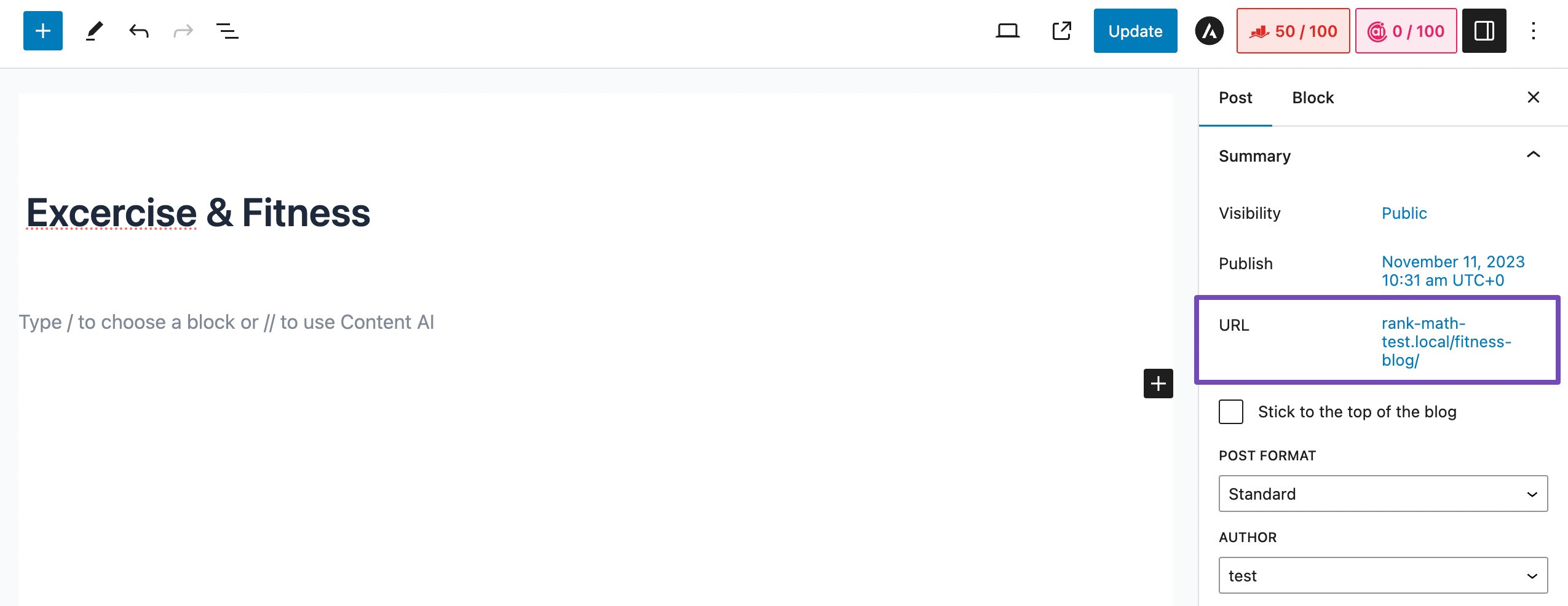
Hyphens are effective word separators, promoting search engine friendliness, as seen in “website.com/healthy-living-tips.”
Avoid keyword stuffing and maintain a balanced approach for focused and relevant URLs, such as “website.com/effective-digital-marketing-strategies.”
Use Breadcrumbs
Using breadcrumbs in website structure is an effective navigational help that enhances the experience of your audience by providing clear pathways and context, thereby enhancing the website structure.
Breadcrumbs provide a hierarchical trail, allowing audiences’ to navigate back to higher-level pages easily. For instance, a breadcrumb trail like Home > Categories > Men’s Apparel > Shirts indicates the audience’s journey through the site’s structure.
Rank Math SEO plugin adds the Breadcrumb Schema that search engines require to show breadcrumbs in search results easily.
Refer to our Technical SEO guide and unlock the secrets to search engine rankings and improve user experience.
4.5 Responsive Design and Mobile Optimization
Responsive layouts are a cornerstone of mobile-friendly web design. They ensure that websites adapt seamlessly to various screen sizes and devices.
Using fluid grids and flexible elements, responsive layouts guarantee that the content remains visually appealing and user-friendly across desktops, tablets, and smartphones.
For example, a responsive design might rearrange and resize elements, such as images and text, for optimal display on a smaller screen, providing a consistent and engaging user experience regardless of the device.
5 Conclusion
Creating an effective website structure is the blueprint for online success. Each element contributes to a seamless and engaging user experience, from user-friendly navigation to SEO optimization and responsive design.
Embracing these principles ensures that your website not only attracts but retains visitors. Remember, a well-structured website is not just a destination; it’s an immersive journey for your audience, guiding them effortlessly through the content and leaving a lasting positive impression.
If you like this post, let us know by Tweeting @rankmathseo.

