WordPress includes versatile menu creation tools that let you build everything from simple header menus to complex dropdown systems without coding knowledge.
Different WordPress themes handle menus differently. Classic themes use the traditional menu editor, while newer block themes leverage the Full Site Editor with the Navigation block. This tutorial covers both approaches in detail. We’ll walk you through creating, editing, and customizing menus.
Table of Contents
- How to Create and Edit a Menu in Classic Themes
- How to Create and Edit a Menu in Block Themes (FSE)
- Advanced Menu Customization
- Troubleshooting Common Menu Issues
- Best Practices for WordPress Menus
How to Create and Edit a Menu in Classic Themes
To create or edit a menu in a classic WordPress theme, log in to your WordPress dashboard.
Then, navigate to Appearance → Menus in the left sidebar.
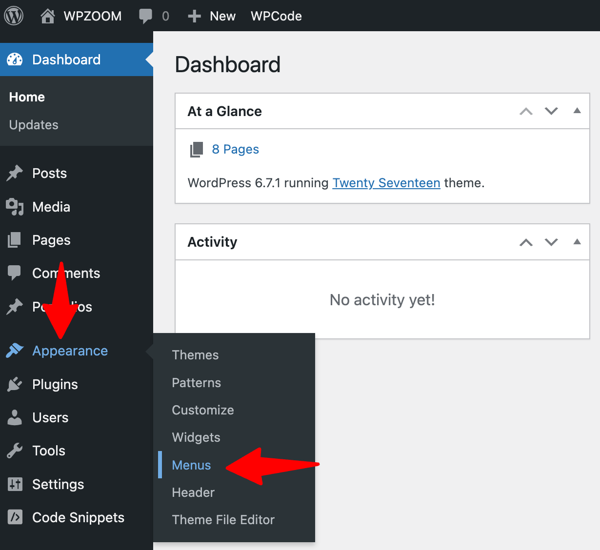

This opens the WordPress menu editor, where you’ll create and manage all your navigation menus.
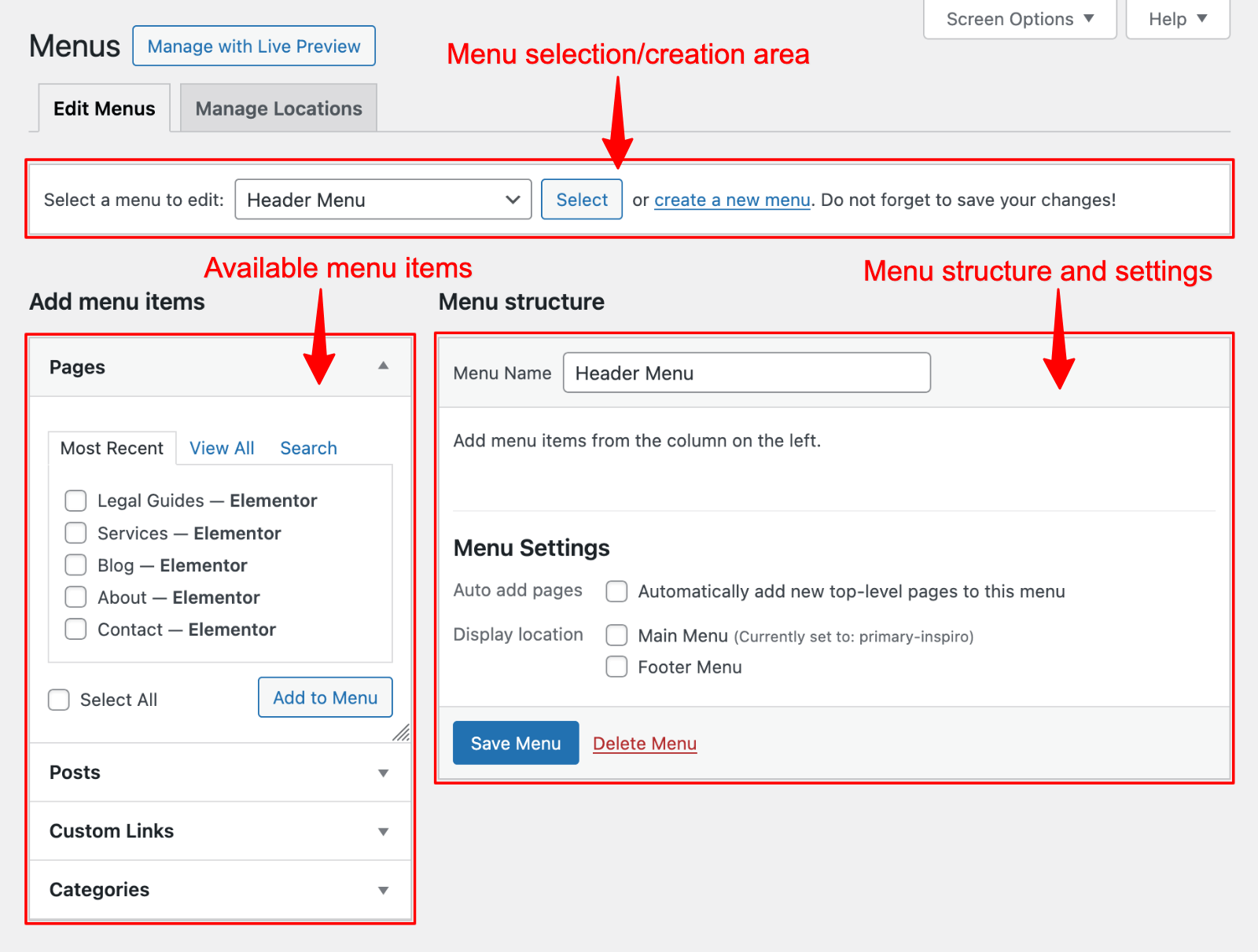
The menu editor interface has three main sections:
- Menu selection/creation area (top)
- “Add menu items” panel with the available menu items (left)
- “Menu structure” area (right)
 Menus” class=”wp-image-812058″ srcset=”https://b8f4g5a7.delivery.rocketcdn.me/wp-content/uploads/2025/04/appearance-menus.png 1600w, https://b8f4g5a7.delivery.rocketcdn.me/wp-content/uploads/2025/04/appearance-menus-734×556.png 734w, https://b8f4g5a7.delivery.rocketcdn.me/wp-content/uploads/2025/04/appearance-menus-1024×775.png 1024w, https://b8f4g5a7.delivery.rocketcdn.me/wp-content/uploads/2025/04/appearance-menus-1536×1163.png 1536w” sizes=”(max-width: 1600px) 100vw, 1600px”/>
If this is your first time creating a menu, you must create one before adding items.
To create a new menu:
- Enter a descriptive name in the “Menu Name” field (e.g., “Main Navigation” or “Header Menu”)
- Click the “Create Menu” button
- WordPress will generate an empty menu ready for your content
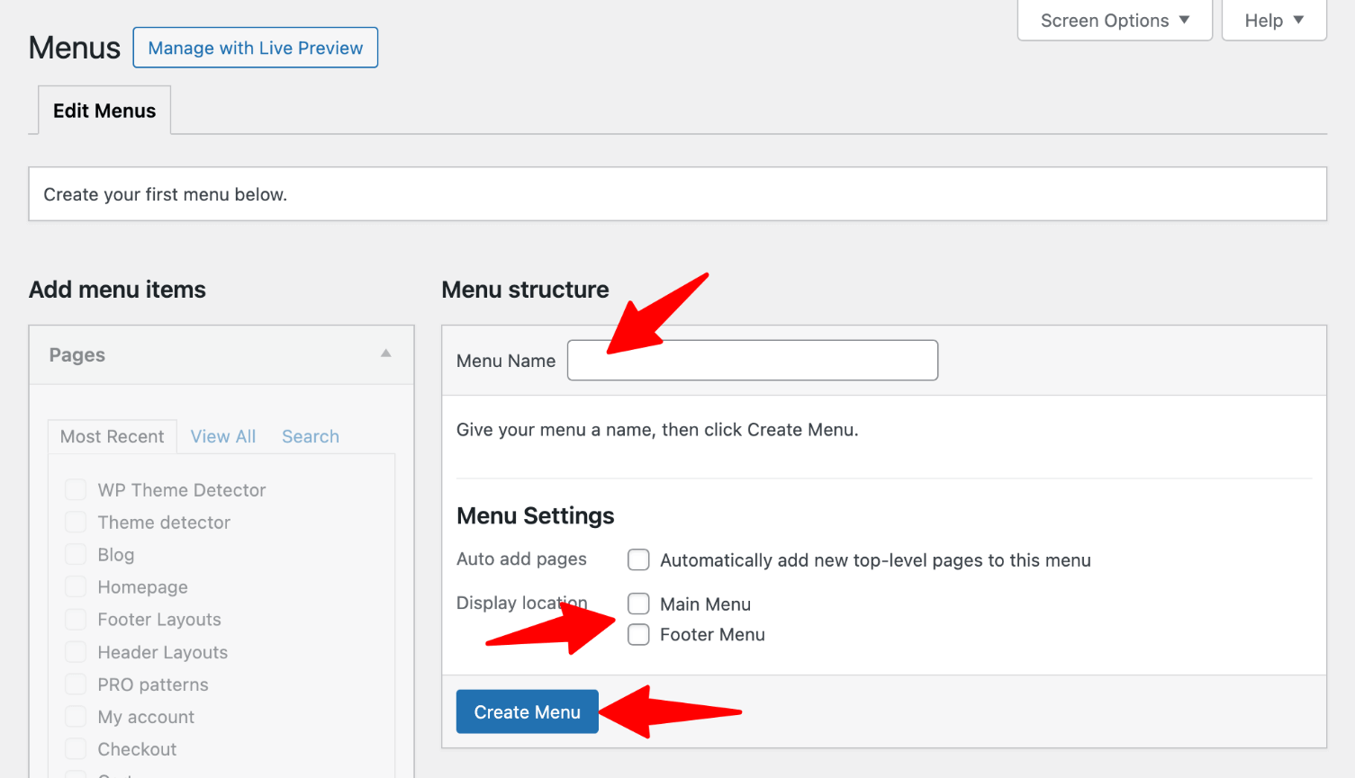

After creating your menu, you must add items and assign the menu to a display location before it appears on your site.
WordPress allows you to add various content types to your navigation menu:
- Pages: Click the “Pages” tab in the left panel, select the pages you want to include, and click “Add to Menu.” You can choose from recently published pages or view all pages.
- Posts: Similarly, the “Posts” tab lets you add individual blog posts to your menu.
- Categories: Want to showcase your blog categories? Use the “Categories” tab to add category archives to your menu.
- Custom Links: Use the “Custom Links” option for external websites or specific sections within pages. Enter the full URL (including https://) and a name for the link.
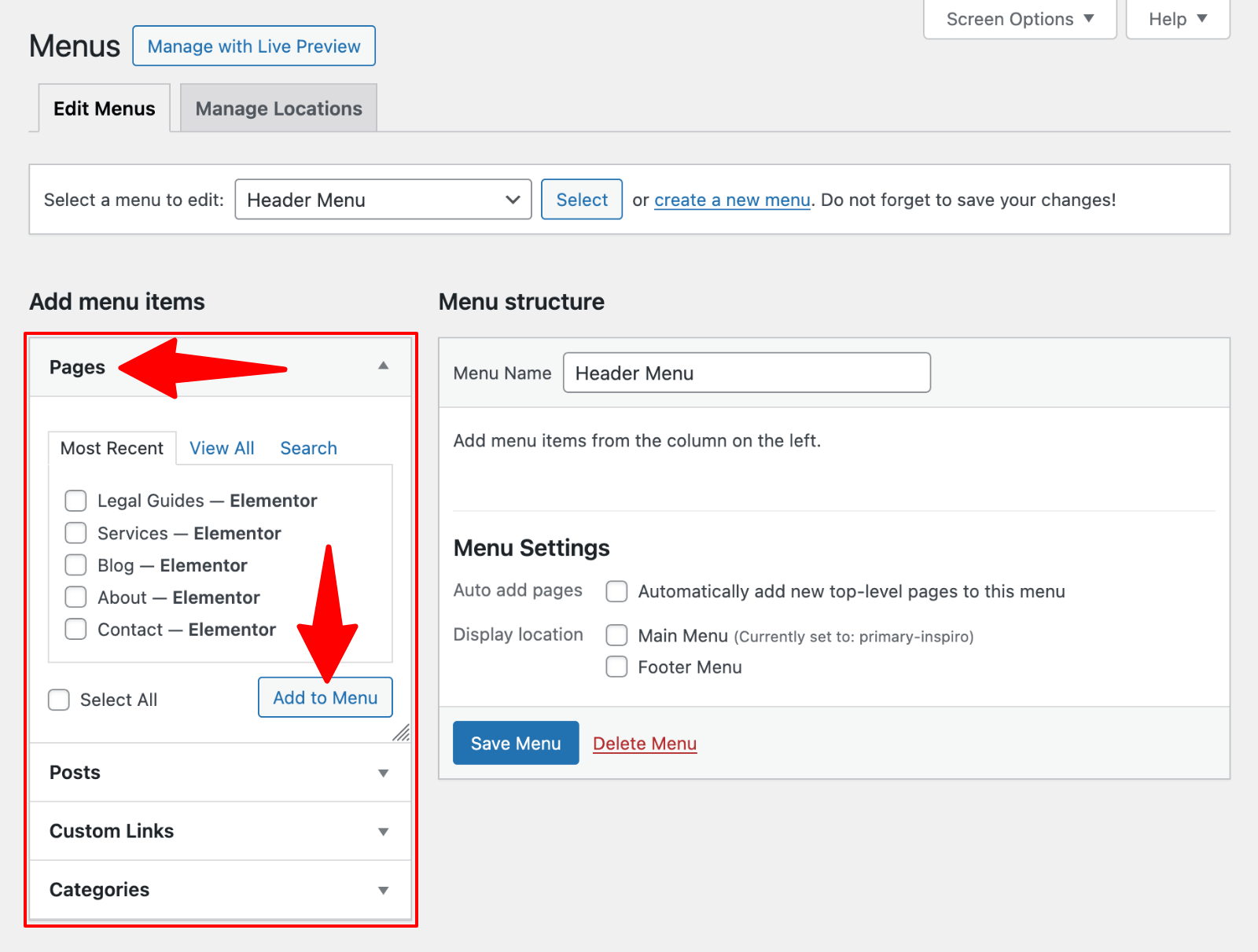

If you don’t see all these options, click “Screen Options” at the top of the page and check the boxes for items you want to display.


Creating dropdown menus is straightforward with WordPress’s drag-and-drop interface:
- Add all required menu items to your menu
- In the menu structure panel, drag the submenu item slightly to the right beneath its parent item
- The indented item will appear as a submenu item in your live menu
- Continue adding multiple items to create a robust dropdown navigation
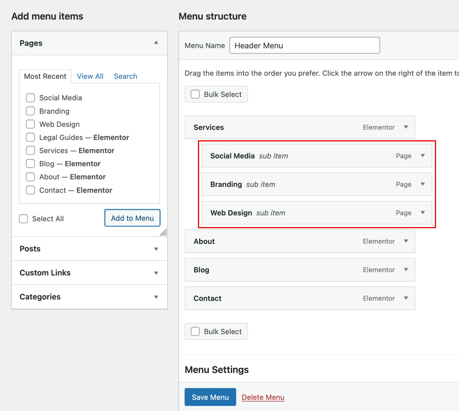

You can create multiple levels of dropdown menus, though most designers recommend limiting to two levels for usability.
Editing and Customizing Menu Items
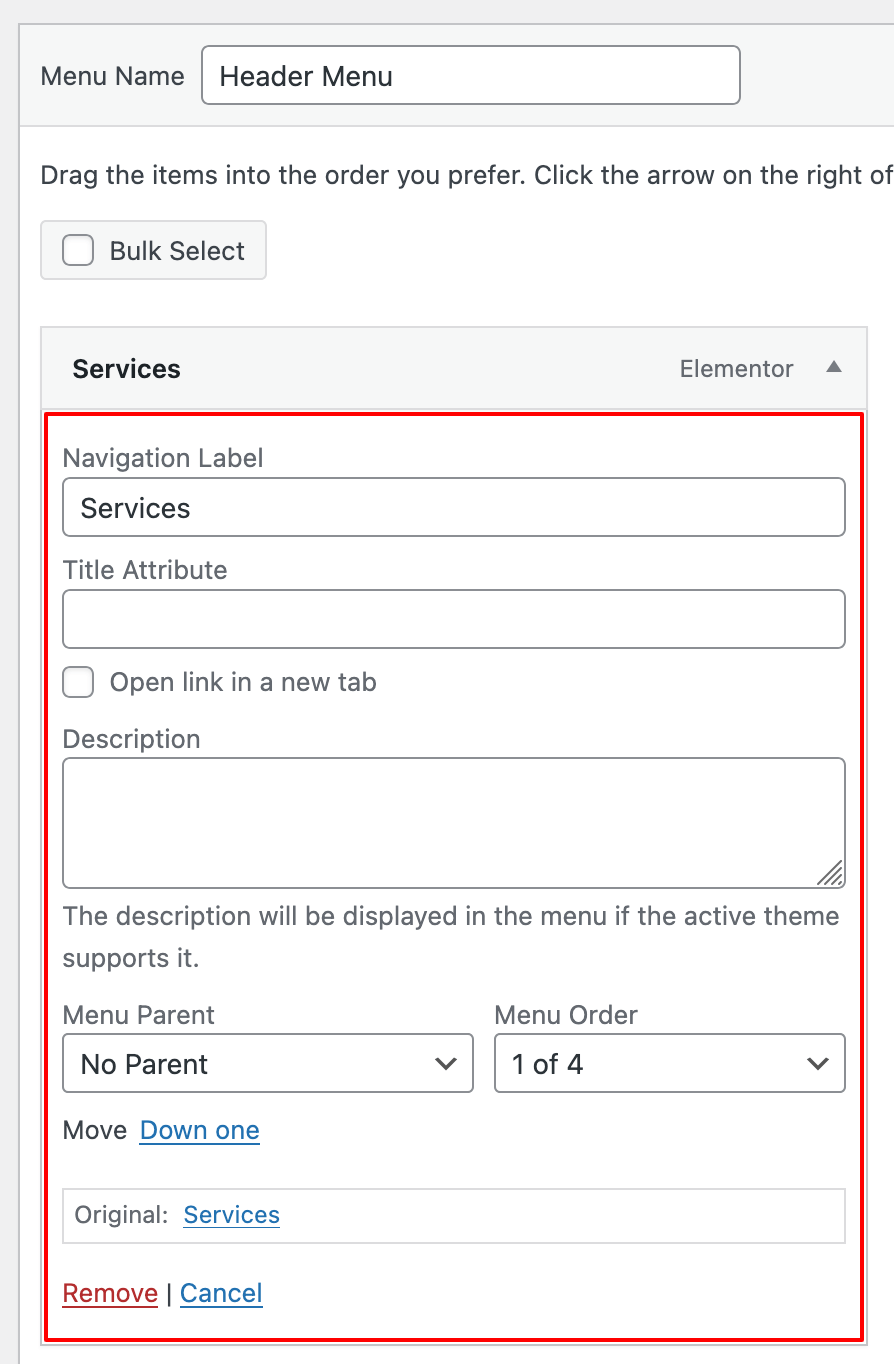
Each menu item can be customized:
- Click the down arrow on any menu item to expand its options
- Change the “Navigation Label” to display different text than the original page title
- Add a “Title Attribute” for tooltip text that appears on hover
- Use “Open link in a new tab” to control link behavior (available under Screen Options)
- Remove unwanted items by clicking “Remove.”

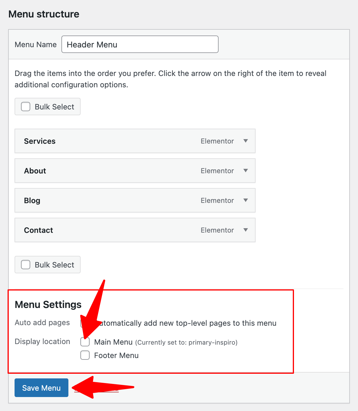
Your WordPress theme determines where menus can appear. To assign your menu to a location:
- Scroll to the “Menu Settings” section
- Check the box next to your desired location (e.g., “Main Menu” or “Footer Menu“)
- Click “Save Menu.”

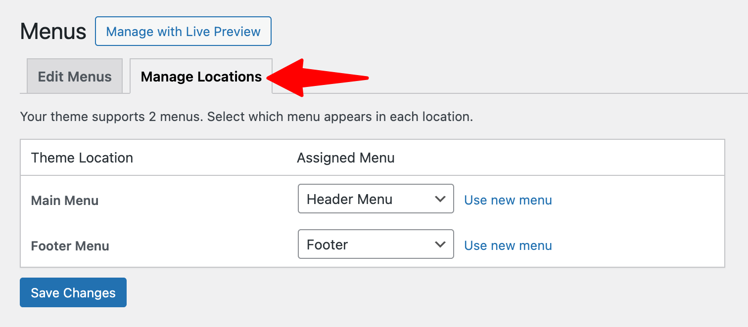
Alternatively, use the “Manage Locations” tab to view all available theme locations and assign menus to each position.
 Manage locations” class=”wp-image-812098″ style=”width:650px” srcset=”https://b8f4g5a7.delivery.rocketcdn.me/wp-content/uploads/2025/04/menus-manage-locations.png 1512w, https://b8f4g5a7.delivery.rocketcdn.me/wp-content/uploads/2025/04/menus-manage-locations-734×321.png 734w, https://b8f4g5a7.delivery.rocketcdn.me/wp-content/uploads/2025/04/menus-manage-locations-1024×448.png 1024w” sizes=”(max-width: 1512px) 100vw, 1512px”/>
Remember to save your menu after making changes by clicking the “Save Menu” button.
Upgrade Your Website with a Premium WordPress Theme
Find a theme that you love and get a 20% discount at checkout with the FLASH20 code

How to Create and Edit a Menu in Block Themes (FSE)
Introduction to the Navigation Block
WordPress has evolved by introducing Full Site Editing (FSE) and block themes. Unlike classic themes that use the traditional menu editor, block themes leverage the Navigation block to create and manage menus directly within the site editor.
Block themes are built entirely with blocks, the same components used in the WordPress content editor. This approach provides greater flexibility and visual editing capabilities, allowing you to see changes in real time as you build your navigation.
Accessing the FSE and Navigation Block
To create a menu using the Full Site Editor:
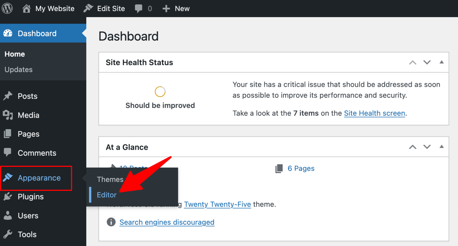
1. Go to Appearance → Editor in your WordPress dashboard.
 Editor” class=”wp-image-812154″ srcset=”https://b8f4g5a7.delivery.rocketcdn.me/wp-content/uploads/2025/04/appearance-editor.png 1600w, https://b8f4g5a7.delivery.rocketcdn.me/wp-content/uploads/2025/04/appearance-editor-734×395.png 734w, https://b8f4g5a7.delivery.rocketcdn.me/wp-content/uploads/2025/04/appearance-editor-1024×551.png 1024w, https://b8f4g5a7.delivery.rocketcdn.me/wp-content/uploads/2025/04/appearance-editor-1536×827.png 1536w” sizes=”(max-width: 1600px) 100vw, 1600px”/>
If you don’t see the Editor option, your theme likely doesn’t support FSE yet. You’ll need to use a block theme.
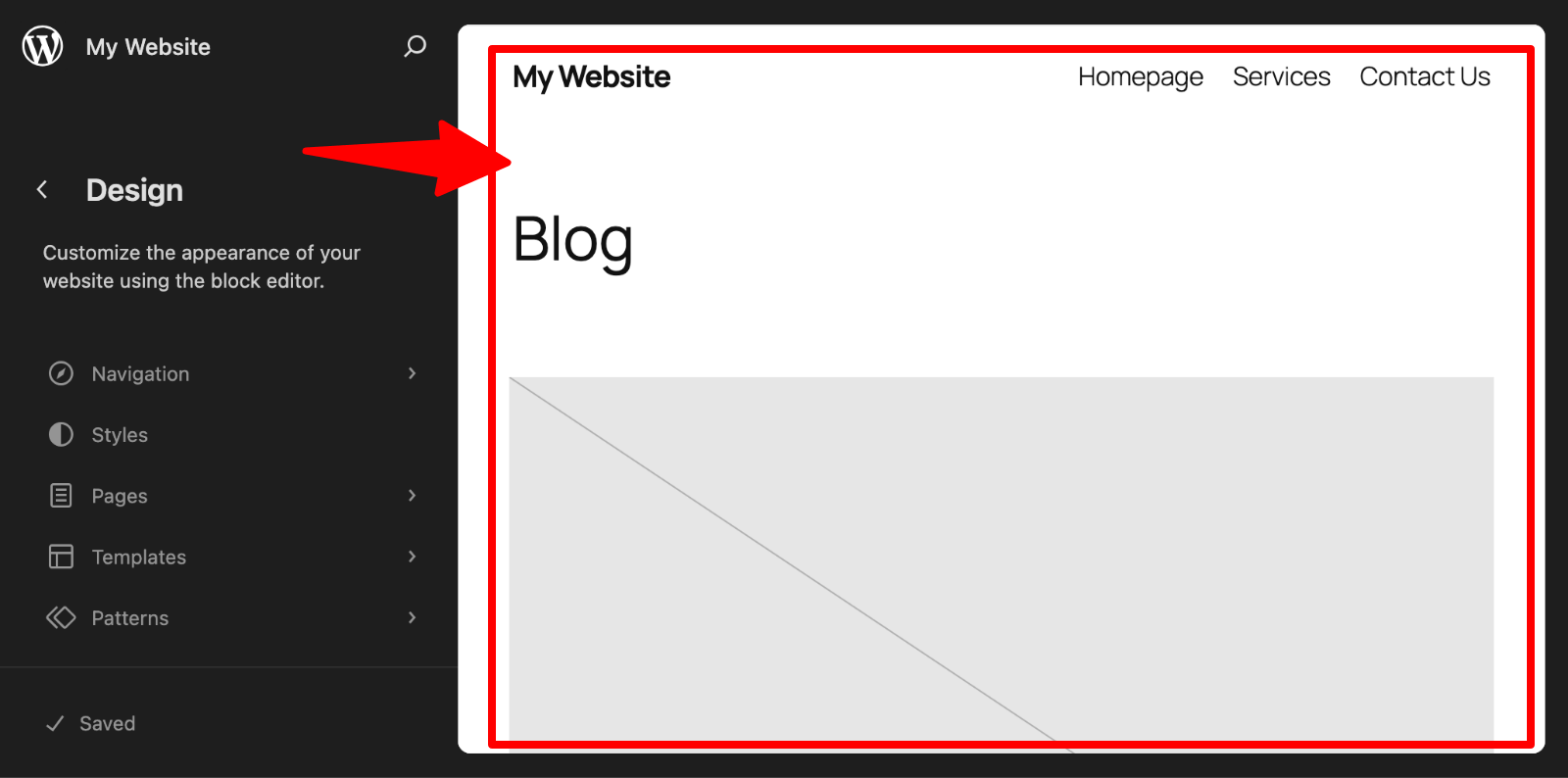
2. This opens the Site Editor interface, where you can edit various parts of your site. Click on the preview of your website, on the right side, to start editing.

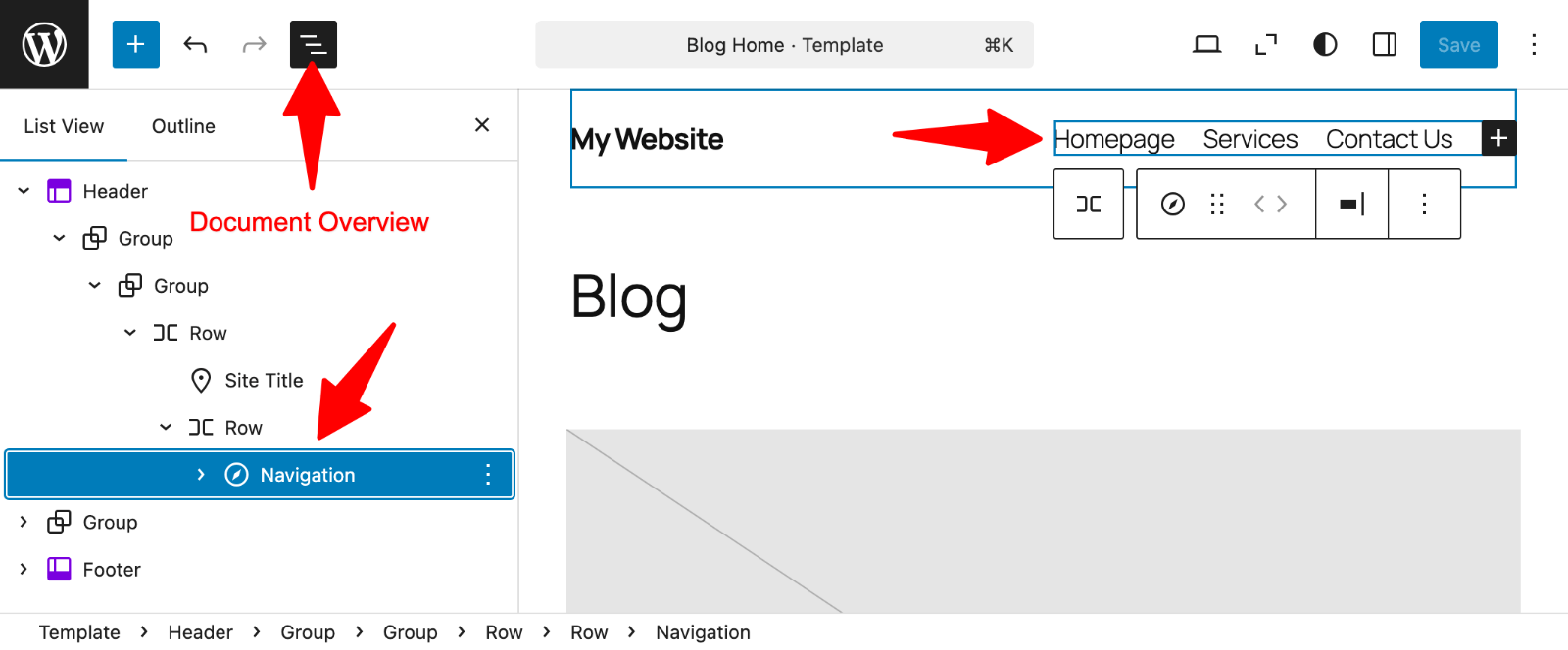
3. Click the Document Overview icon to open the panel with all the blocks.
Look for the Navigation block in the opened panel and click on it. This will select the Navigation block from your header template in the website preview section on the right side.
 Navigation block” class=”wp-image-812158″ srcset=”https://b8f4g5a7.delivery.rocketcdn.me/wp-content/uploads/2025/04/editor-navigation-block.png 1600w, https://b8f4g5a7.delivery.rocketcdn.me/wp-content/uploads/2025/04/editor-navigation-block-734×305.png 734w, https://b8f4g5a7.delivery.rocketcdn.me/wp-content/uploads/2025/04/editor-navigation-block-1024×425.png 1024w, https://b8f4g5a7.delivery.rocketcdn.me/wp-content/uploads/2025/04/editor-navigation-block-1536×637.png 1536w” sizes=”(max-width: 1600px) 100vw, 1600px”/>
You can add a new Navigation block where needed, if you don’t see one.
Click the “+” icon and choose the Navigation block.
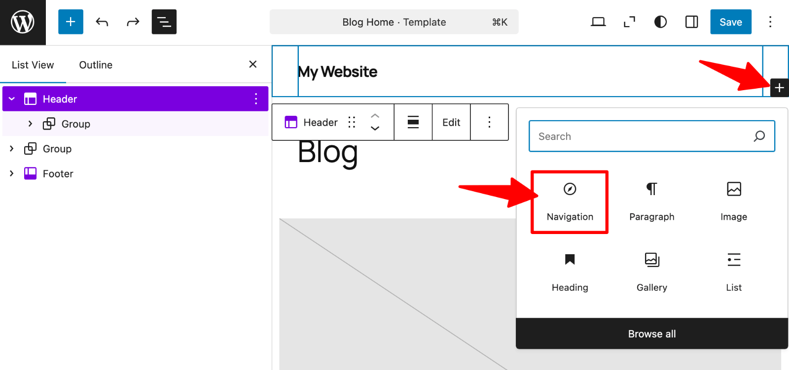 Add Navigation block” class=”wp-image-812161″ srcset=”https://b8f4g5a7.delivery.rocketcdn.me/wp-content/uploads/2025/04/editor-add-navigation-block.png 1600w, https://b8f4g5a7.delivery.rocketcdn.me/wp-content/uploads/2025/04/editor-add-navigation-block-734×345.png 734w, https://b8f4g5a7.delivery.rocketcdn.me/wp-content/uploads/2025/04/editor-add-navigation-block-1024×481.png 1024w, https://b8f4g5a7.delivery.rocketcdn.me/wp-content/uploads/2025/04/editor-add-navigation-block-1536×721.png 1536w” sizes=”(max-width: 1600px) 100vw, 1600px”/>
To build a navigation menu with blocks:
1. In the Site Editor, click on the Navigation block.
2. Click the “+” icon within the Navigation block.
Choose from pages, posts, categories, or add custom links to add menu items.
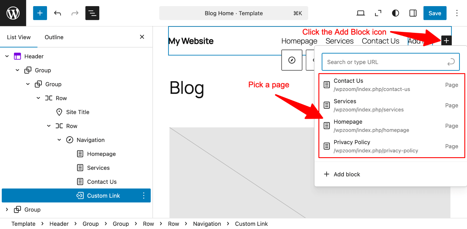 Add a page to menu” class=”wp-image-812168″ srcset=”https://b8f4g5a7.delivery.rocketcdn.me/wp-content/uploads/2025/04/editor-add-page-to-menu.png 1600w, https://b8f4g5a7.delivery.rocketcdn.me/wp-content/uploads/2025/04/editor-add-page-to-menu-734×360.png 734w, https://b8f4g5a7.delivery.rocketcdn.me/wp-content/uploads/2025/04/editor-add-page-to-menu-1024×502.png 1024w, https://b8f4g5a7.delivery.rocketcdn.me/wp-content/uploads/2025/04/editor-add-page-to-menu-1536×754.png 1536w” sizes=”(max-width: 1600px) 100vw, 1600px”/>
Each item appears as a separate block within the Navigation container.
3. Rearrange items by clicking the Drag icon and dragging or using the Move left/Move right controls in the toolbar.
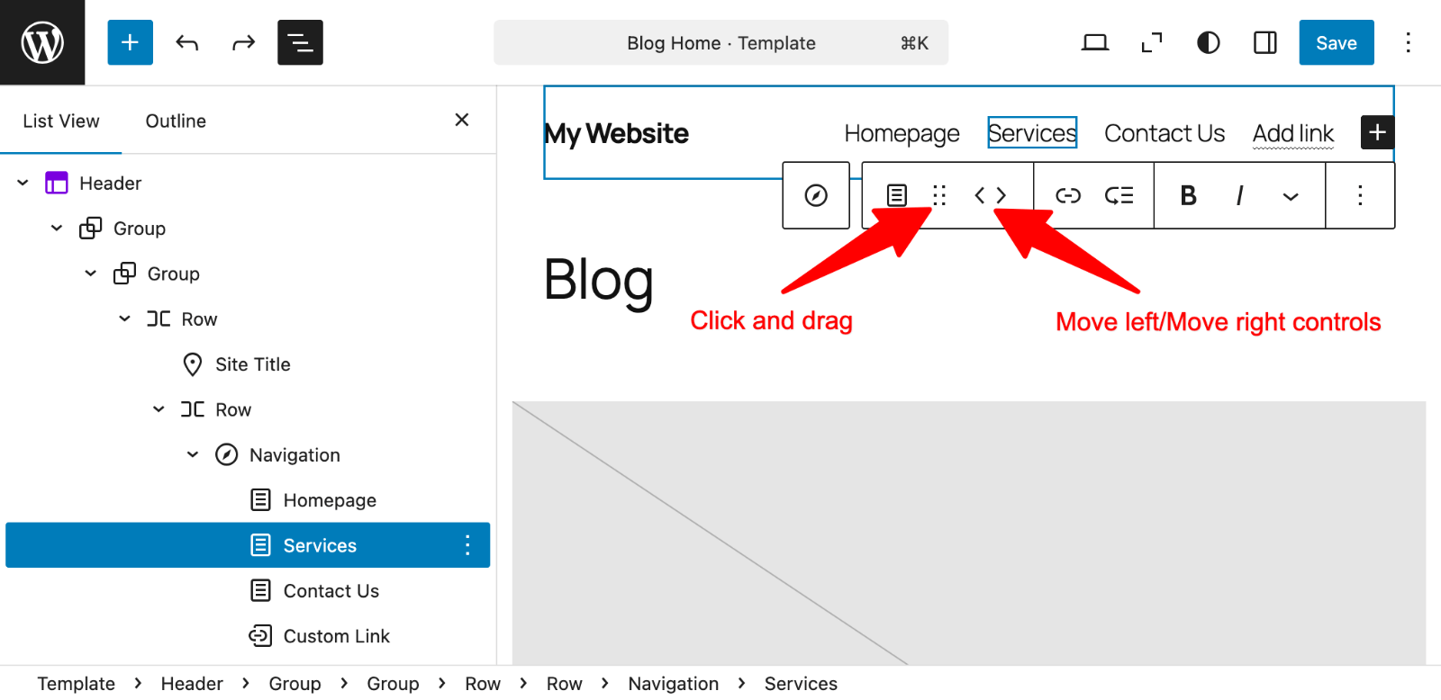

The Navigation block automatically pulls existing menus if you’ve created them previously. You can select a different menu from the block settings panel on the right.
Creating dropdown menus in the block editor works differently than in classic themes:
- Select the menu item that will serve as the parent.
- Click the “Add submenu” icon.
- Add your submenu items as you would regular menu items.
- Adjust the submenu appearance using the block settings panel.
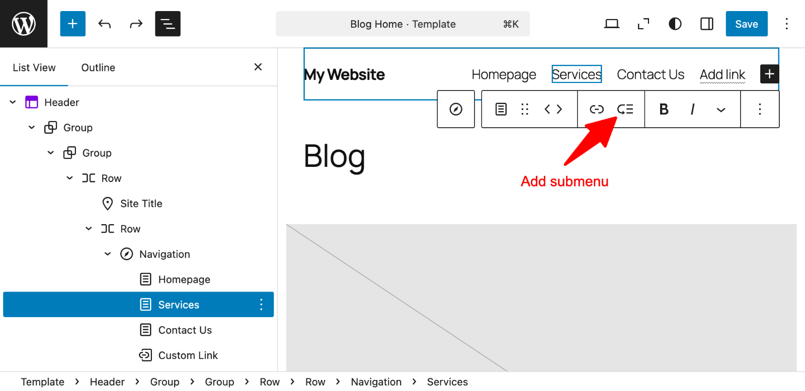 Add submenu” class=”wp-image-812176″ srcset=”https://b8f4g5a7.delivery.rocketcdn.me/wp-content/uploads/2025/04/editor-add-submenu.png 1600w, https://b8f4g5a7.delivery.rocketcdn.me/wp-content/uploads/2025/04/editor-add-submenu-734×357.png 734w, https://b8f4g5a7.delivery.rocketcdn.me/wp-content/uploads/2025/04/editor-add-submenu-1024×498.png 1024w, https://b8f4g5a7.delivery.rocketcdn.me/wp-content/uploads/2025/04/editor-add-submenu-1536×747.png 1536w” sizes=”(max-width: 1600px) 100vw, 1600px”/>
You can preview how dropdowns will appear by using the site preview function in the editor.
Customizing the Navigation Block
The Navigation block offers extensive customization options.
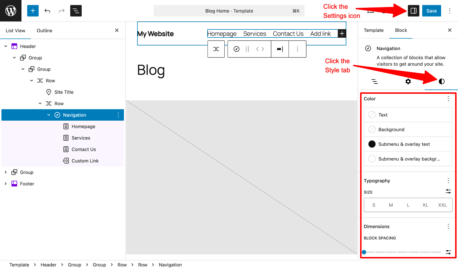
1. Select the Navigation block.
2. Click the Settings icon.
3. Click the Style tab in the right sidebar.
 Menu style” class=”wp-image-812179″ srcset=”https://b8f4g5a7.delivery.rocketcdn.me/wp-content/uploads/2025/04/editor-menu-style.png 1600w, https://b8f4g5a7.delivery.rocketcdn.me/wp-content/uploads/2025/04/editor-menu-style-734×432.png 734w, https://b8f4g5a7.delivery.rocketcdn.me/wp-content/uploads/2025/04/editor-menu-style-1024×602.png 1024w, https://b8f4g5a7.delivery.rocketcdn.me/wp-content/uploads/2025/04/editor-menu-style-1536×903.png 1536w” sizes=”(max-width: 1600px) 100vw, 1600px”/>
Colors and Typography:
- Adjust text color, background color, font size, and typography settings
- Change link and hover colors to match your branding
Layout and Spacing:
- Modify alignment (left, center, right) from the toolbar
- Change orientation between horizontal and vertical layouts
- Adjust the spacing between menu items in the Dimensions panel
Mobile Menu Settings:
- Configure how your menu behaves on mobile devices
- Set overlay menu options and icon styles
- Choose between icon-only, text-only, or icon-and-text display
Adding Special Elements to Navigation
The Navigation block supports more than just links:
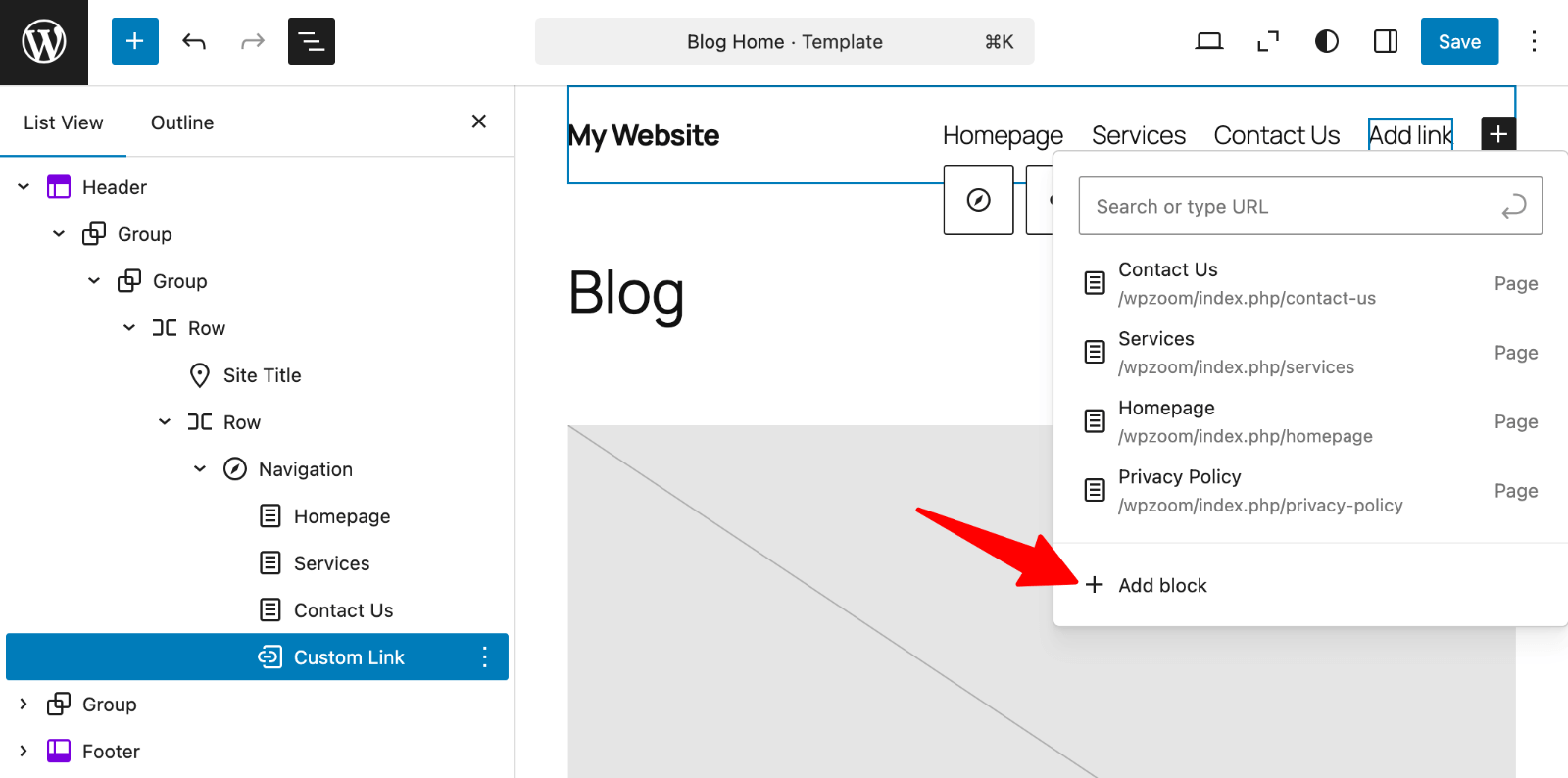
1. Click the “+” icon within the Navigation block
2. Click on “Add block“.
 Menu > Add block” class=”wp-image-812180″ srcset=”https://b8f4g5a7.delivery.rocketcdn.me/wp-content/uploads/2025/04/editor-menu-add-block.png 1600w, https://b8f4g5a7.delivery.rocketcdn.me/wp-content/uploads/2025/04/editor-menu-add-block-734×364.png 734w, https://b8f4g5a7.delivery.rocketcdn.me/wp-content/uploads/2025/04/editor-menu-add-block-1024×508.png 1024w, https://b8f4g5a7.delivery.rocketcdn.me/wp-content/uploads/2025/04/editor-menu-add-block-1536×762.png 1536w” sizes=”(max-width: 1600px) 100vw, 1600px”/>
3. Search for blocks like Search, Social Icons, or Site Logo
4. Insert them alongside your navigation links
5. Customize their appearance using the block settings
This flexibility allows you to create more functional navigation areas that combine menus with search functionality, social links, and other valuable elements.
Using Menu Widgets in Sidebars and Footers
WordPress allows you to display navigation menus beyond the main header using widgets:
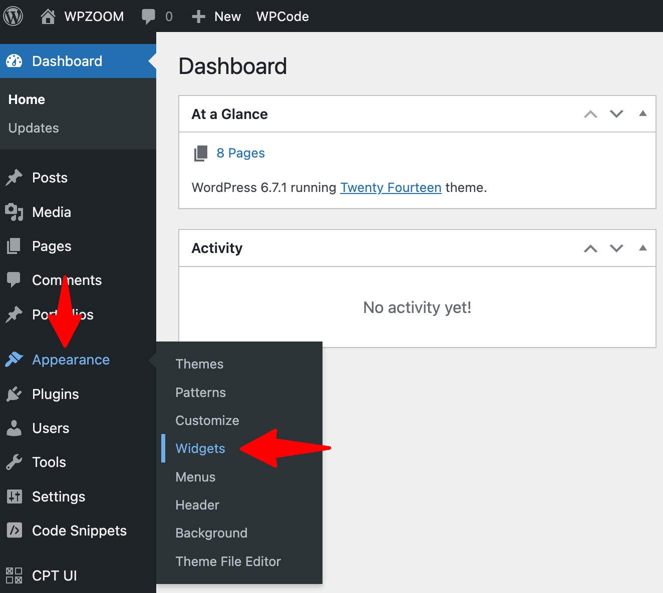
1. Go to Appearance → Widgets in your dashboard.

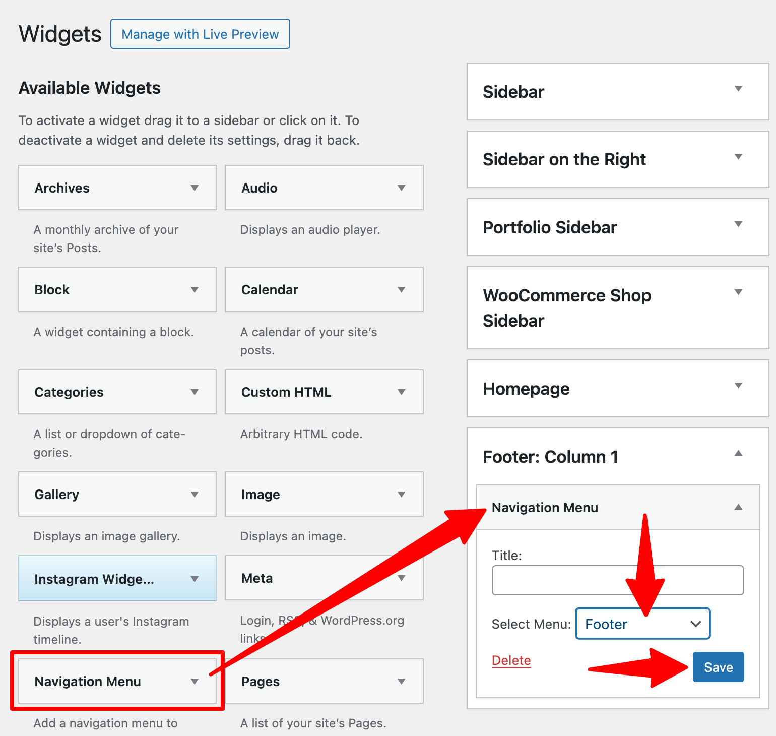
2. Find the “Navigation Menu” widget.
3. Drag it to your desired widget area (sidebar, footer, etc.).
4. Select which menu to display from the dropdown.
5. Add an optional title above the menu.
6. Save your changes.
 Add menu” class=”wp-image-812183″ style=”width:650px” srcset=”https://b8f4g5a7.delivery.rocketcdn.me/wp-content/uploads/2025/04/widgets-add-menu.png 1540w, https://b8f4g5a7.delivery.rocketcdn.me/wp-content/uploads/2025/04/widgets-add-menu-734×696.png 734w, https://b8f4g5a7.delivery.rocketcdn.me/wp-content/uploads/2025/04/widgets-add-menu-1024×971.png 1024w, https://b8f4g5a7.delivery.rocketcdn.me/wp-content/uploads/2025/04/widgets-add-menu-1536×1456.png 1536w” sizes=”(max-width: 1540px) 100vw, 1540px”/>
This approach works well for secondary navigation, category lists, or important links you want to highlight in multiple locations throughout your site.
A mega menu might be the best solution when your site has extensive content requiring complex navigation. Mega menus display multiple columns of organized links when a parent menu item is clicked or hovered over.
While WordPress doesn’t include mega menu functionality by default, plugins like Max Mega Menu can add this capability:
- Install and activate your chosen mega menu plugin
- Configure the basic settings according to the plugin’s documentation
- Use the plugin’s interface to transform regular dropdown menus into multi-column mega menus
- Add images, widgets, or custom HTML to enhance your mega menu
These powerful navigation tools work particularly well for online stores, news sites, and content-rich websites with many categories.
For more precise control over your menu’s appearance, custom CSS provides powerful customization options:
Where to add custom CSS:
- Customizer: Go to Appearance → Customize → Additional CSS
- Theme options: Some themes, like Inspiro Premium, include custom CSS sections
- Child theme: Add CSS to your child theme’s stylesheet
Adding Images and Icons to Menus
Enhance your navigation with visual elements:
- Install a menu icon plugin like “Menu Image” or “Menu Icons“
- Edit your menu items in Appearance → Menus
- Use the plugin’s options to add icons or images to menu items
- Adjust size, position, and appearance
- Save your menu to see the visual elements in action
Icons can improve menu clarity, especially for international audiences or when creating a more visual navigation system.
Upgrade Your Website with a Premium WordPress Theme
Find a theme that you love and get a 20% discount at checkout with the FLASH20 code


If your menu isn’t appearing where expected:
- Check if you’ve assigned the menu to the correct theme location
- Verify that your theme supports the menu location you’ve selected
- Make sure you clicked “Save Menu” after making changes
- Try switching to a default WordPress theme temporarily to check if the issue is theme-related
When dropdown menus malfunction:
- Ensure you’ve correctly nested items by dragging them slightly to the right
- Check for JavaScript conflicts from plugins that might affect menu behavior
- Test in different browsers to isolate browser-specific issues
- Inspect your theme’s CSS for styling issues affecting dropdown visibility
Mobile menu problems typically stem from:
- Responsive design issues in your theme
- Menu container width constraints
- JavaScript errors are preventing mobile menu toggling
- Too many menu items are causing overflow problems
Use your browser’s mobile emulation tools to debug or test on actual mobile devices.
Issues After Switching Themes
When changing themes, menu issues often occur because:
- The new theme has different menu locations
- Your previous menu relies on functionality not supported by the new theme
- Custom CSS for menus no longer applies
Go to Appearance → Menus → Manage Locations to reassign your existing menus to the new theme’s locations.
If menu changes don’t persist:
- Check for plugin conflicts, especially caching plugins
- Temporarily deactivate plugins to identify the source
- Clear your browser cache and WordPress cache
- Ensure your database has adequate permissions
- Keep Primary Navigation Simple and Focused. Your main menu should highlight only the most essential pages. Most successful websites limit their primary navigation to 5-7 items. When visitors face too many choices, they often make none. Keep your main menu clean and straightforward to guide users effectively.
- Use Descriptive but Concise Menu Labels. Each menu label should clearly communicate where the link leads. Avoid vague terms like “Services” when “Web Design Services” would be more specific. Yet, balance clarity with brevity. Keep labels short enough to prevent menu overflow on smaller screens.
- Consider Mobile Users in Your Menu Design. Mobile users now account for most web traffic. Test your navigation on various devices and screen sizes. Complex dropdown structures often become challenging to use on touchscreens. Consider implementing a specialized mobile menu that simplifies navigation for touch interactions.
- Test Your Menu on Different Devices and Browsers. Menu display can vary significantly between browsers. Check your navigation on Chrome, Firefox, Safari, and Edge at minimum. Test on iOS and Android devices to catch potential inconsistencies or usability issues before visitors encounter them.
- Use Consistent Styling Across All Menus. Visual consistency builds trust and improves usability. Maintain similar styling, spacing, and behavior across all your site’s menus. This cohesive approach helps visitors quickly understand how to navigate your entire website, regardless of where they are.
- Make Important Pages Easily Accessible. Critical pages like Contact, About, and main service/product pages should never be more than one click away. Consider which pages generate leads or sales directly and ensure these maintain prominent positions in your navigation structure.
- Position Your Menu in Intuitive Locations. Place menus where users expect to find them, typically at the top of the page for main navigation, in the footer for secondary links, and in sidebars for section-specific navigation. Following established patterns makes your site instantly more usable for first-time visitors.
Transform Your Website Navigation with WPZOOM Themes
Ready to create stunning, user-friendly navigation menus without the headaches? WPZOOM themes come with pre-built navigation layouts and enhanced menu functionality that make creating professional menus simple.
Our responsive designs ensure your menus work perfectly across all devices, while our intuitive customization options let you match your brand perfectly. Stop struggling with menu limitations and start building websites your visitors will love navigating!
Check out our premium WordPress themes today and take your website navigation from functional to fantastic.

